Courtney Warren is a Texas-based interior designer whose work has been featured in Real Simple, Better Homes & Gardens, Good Housekeeping, Apartment Therapy, and Today.com. She is a frequent consultant on Fox 4 TV’s Good Day program in Dallas, was ranked in the top 3 percent of interior designers in the US by Houzz.com, and starred in the Dallas episode of TLC’sFour Houses. She delights in helping overwhelmed clients create beautiful spaces—and will never turn down a warm chocolate chip cookie or Diet Dr Pepper.
Shop the projects
My Go-To design accessories
5 Paint Colors Designers Love
The pressure is real — picking the right interior paint color can make or break a space’s design AND mood. It’s also not as easy as most people think. Paint colors are notorious for being total chameleons. Their color properties change depending on the space and light they live in. If you’re brainstorming new colors for your home but need some help, I’ve got you covered! I also know how frustrating the whole process can be. Here’s what I usually hear from family, friends, and clients.
“
Should I research what’s trending?
Jeez, 48 swatches later, and I’m still lost.
What is greige?
What do you mean, white isn’t just white?
I don’t want to pick the wrong color and need to redo the whole room and spend more money.
Uh, oh, so many choices. It’s overwhelming.
Sound familiar?
Here are a few things to know that will help.
But first…
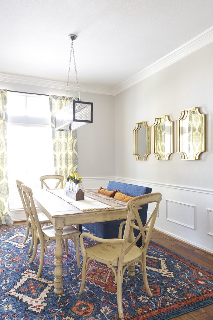
Why does that sandy beige in the store now look greeny gold in our dining room? And what about that other grey? Why does it look purple?
Are my eyes playing tricks on me?
Nope! So what’s going on?
Well, picking a color from your paint chip doesn’t guarantee how the color will look. I know, I know– why make them in the first place?
Here’s what I recommend instead. Once you determine your A-list choices, you MUST paint them onto posterboard and LIVE with them for a few days. Samplize also has peel-and-stick paint samples made from real paint. It’s such an easy way to test your final choices and determine things like…
Are the undertones too green? Or pink?
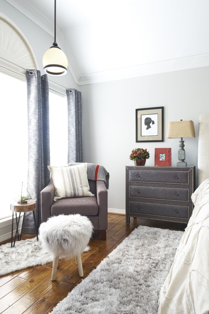
Because LIGHTING CHANGES EVERYTHING!
The amount of light in a space will bring out certain undertones. And each color has an LRV, which I cover down below.
So before you commit to a color, ask yourself:
- How does your paint sample look in the morning?
- In the evening?
- By task light?
- With your furniture?
Trust me. It’s worth the extra step because when your room is done, and that color is not how you imagined it, you WILL be upset. AND most likely need a redo.
Neutral Interior Paint Colors
These pesky undertones will also come out in the most basic colors too–like greys and whites. These classics are not immune to light effects. But both are compatible with so many other colors.
Gray always wins in my book! Gray can provide a soft neutral background or a deep, moody wow factor in your rooms! It’s a champ in every way–and can be bold or quiet, letting your furniture and other architectural features take the spotlight.
In my homes and my design work, I gravitate towards warmer grays. These shades of gray won’t look cold or sterile.

SW Agreeable Gray
WHICH GRAY?
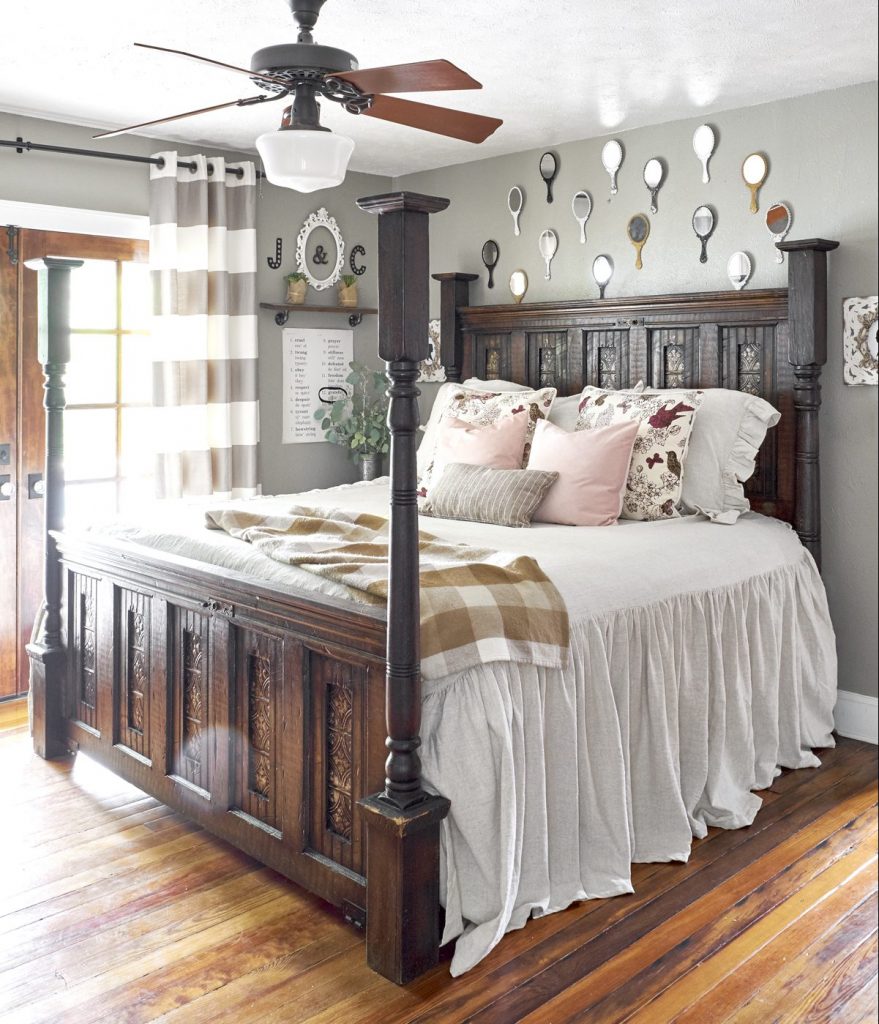
I’ve lost count of the number of rooms where I’ve used Sherwin Williams’ Agreeable Gray–including our master bedroom. It’s a perfect warm neutral. Because it falls in that “greige” range of grays, it pairs well with almost any design scheme. Depending on your lighting and/or time of day, it can read grayer or more beige.
Agreeable Gray’s Light Reflective Value is 60, reflecting slightly more light than it absorbs. You can check your paint card for LRV, a scale from 0 (deepest black, absorbing all light) to 100 (whitest white, reflecting all light). For example, in a room with lots of windows, you could use a lower LRV paint, so it doesn’t suck all the light out of the room. A higher LRV paint will look darker in a less well-lit room than it would in a brightly lit room. So again… please consider your lighting as you pick colors!
WHICH White?
I get asked a lot about trim color for gray, especially Agreeable Gray, since I use it so much. I find it a perfect white–soft, just the right amount of creaminess so that it’s not too stark with any grey or greige.
Looking for more easy options? I talk about the best neutral paint colors here!

SW Indigo Batik
Which Blue?
Looking for something bolder than a plain old neutral? Bold blues and champagne golds for ceiling contrast or front doors are a nice choice too!
A real, SOLID blue. It’s peaceful and reliable. It’s an excellent choice for an office space where you need to focus AND stay calm through stressful meetings.
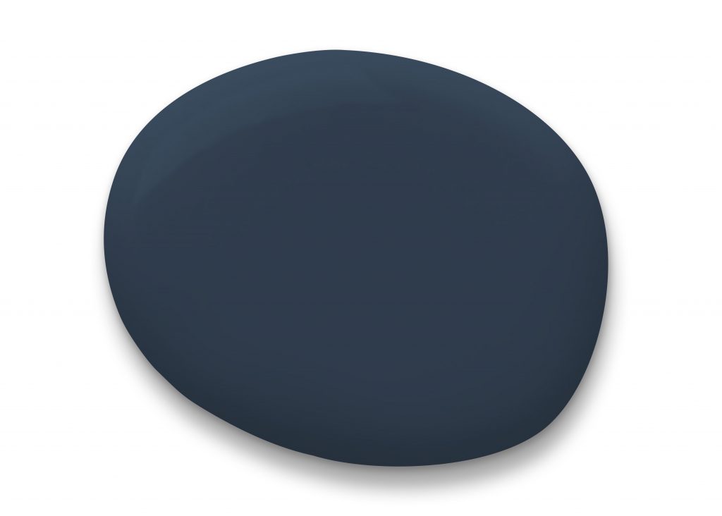
SW Naval
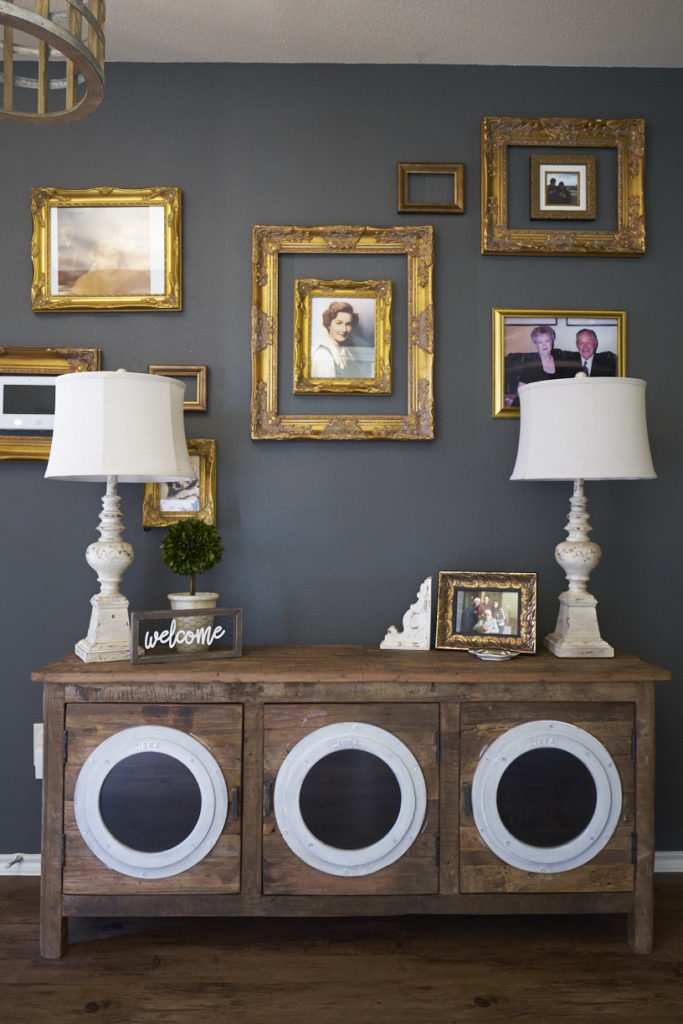
A vibrant navy shade can cocoon a small bathroom or fill a whole room to UP the drama factor. It’s a luxe color that may remind you of the sea or a night sky.
Top Tip: Always try to paint contiguous rooms like the dining and living room cohesively, so there is a smooth transition between rooms. What I’m saying is don’t go from purple to lime green.
The Best Warm and Modern Interior Paint Color

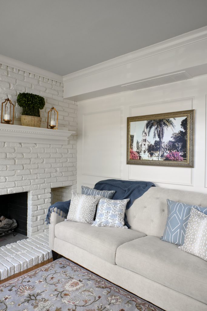
SW Pure White
SW Pure White is a whiter white than Alabaster, and it’s a stunner for trim work. ALWAYS look at your trim color with your wall color to see if they’re compatible. You don’t want a very warm yellowy-white trim with a cool grey wall.
This white is one of the BEST shades of white for interiors. White is also a modern color that works with any home or decor style. Sometimes whites can look very stark and feel cold, however.
SW Pure White is the opposite! It’s bright and clean without feeling sterile. It’s a great color for your trims, walls, AND cabinets. For these reasons, it is an all-purpose white shade that’s timeless.
Still not sure how to pick interior paint colors for your rooms?
I’ve got more tips to share. I’ll walk you through the process in just three easy steps!
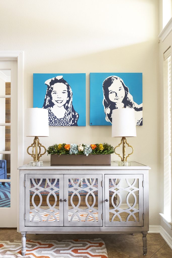
Do you wish for a home that fits your design style and life?
I’m all about helping you love your home and create spaces that feel comfortable for you and your family! I can also help you through any design questions (big or small) like interior paint colors, hardware choices, or space planning!
I offer a complimentary, no-strings-attached phone call consultation. We can also consult by video conference. If you’d like to meet at your home, please know we will use all current safety protocols.
✆ EMAIL ME TO BOOK A CALL TIME!
Don’t forget to connect with us here:
- Instagram @courtneywarren
- Facebook page
- And check out what we can do for YOU on our YouTube Channel– Real Life Design with Courtney Warren Home.
