Courtney Warren is a Texas-based interior designer whose work has been featured in Real Simple, Better Homes & Gardens, Good Housekeeping, Apartment Therapy, and Today.com. She is a frequent consultant on Fox 4 TV’s Good Day program in Dallas, was ranked in the top 3 percent of interior designers in the US by Houzz.com, and starred in the Dallas episode of TLC’sFour Houses. She delights in helping overwhelmed clients create beautiful spaces—and will never turn down a warm chocolate chip cookie or Diet Dr Pepper.
Shop the projects
My Go-To design accessories
Designing with Pets in Mind
Good news, pet owners! Research confirms that pets can contribute to improvements in your health and well-being. Your mood, your blood pressure, your physical fitness, your immune system, even your social life can be enhanced by having a pet!
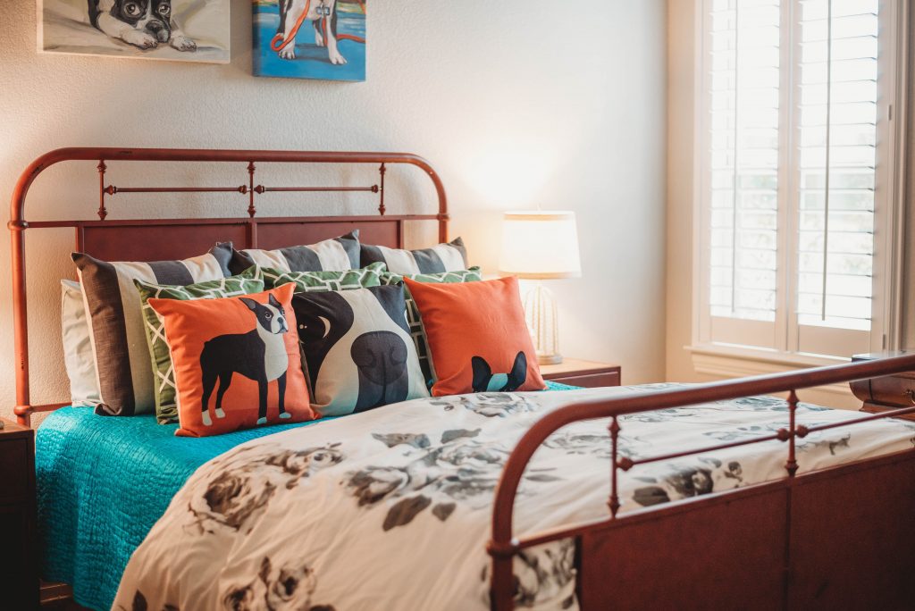
I’m sure my client Melinda already knows this, because she’s ALL ABOUT her boxers. So much so, in fact, that she wanted them as the theme for her guest room decor. Now, do the pooches get to nap on the bed in “their” room? Ask Melinda! (And if you love the dears but not their fur, here’s a good article on pet-proof decorating.)
How does a designer approach the pets-as-decor assignment? I’m glad you asked!
#1. Use a single piece, such as a picture, rug, or fabric, to establish your color scheme.
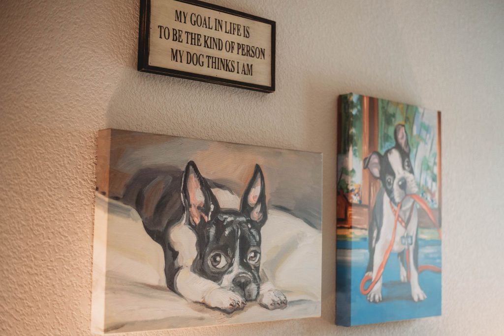
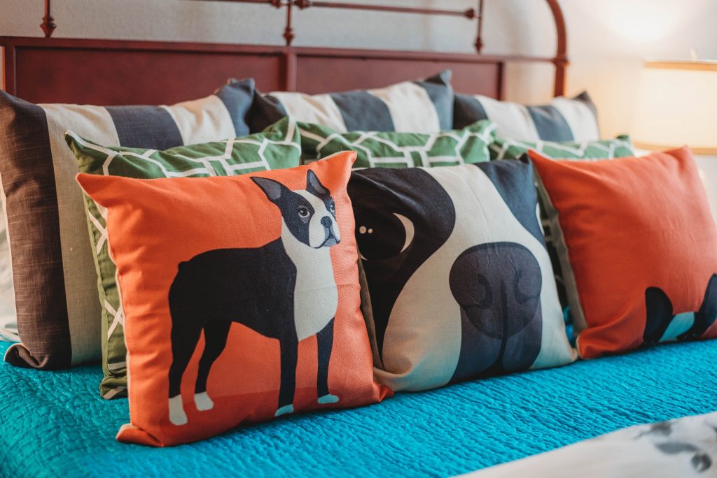
I began by pulling the color scheme for this bright, happy room from the puppy portrait above the bed. Black and white mimic the boxer’s tux and also ground the scheme. The orange, blue and green inject lively bursts of color. (Really, can you use florals and stripes together? Absolutely! In fact, it’s one of my favorite combinations when mixing patterns.)
#2 Determine what kind of mood you want in the room.
Nothing stuffy about this decor! The playful wall decor signals guests that good times abound in this household. Especially if you like doggie kisses. Your mood may be more formal, or even more playful. Choose furniture, fabrics, and accessory styles that put across that feeling. Probably no damask or brocade in the farmhouse. (Then again, I’ve been known to do the unexpected…)
I found the graphic pillows online–including the adorable boxer ones. There are near-limitless sources for your idea, whatever it is! A color combo, a certain era, or paint-by-number landscapes? It’s all out there, and I can source it for you.
#3 Make it yours with YOUR things–but EDIT!
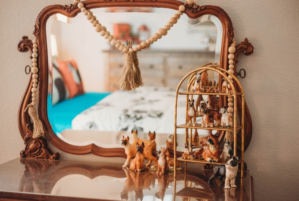
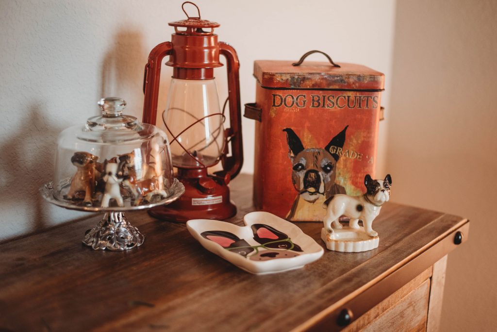
One thing that makes a space YOUR OWN and not some hotel room or store display is personalizing it with items meaningful to you. We used some of Melinda’s heirloom furniture pieces and then incorporated, among other things, her collection of boxer figurines.
Collection display tip: vary sizes and elevate some!
(You know that collections always have more impact when displayed together, right? Now, I don’t mean all 100 of your Bakelite mirrors at once–you can rotate some in and out.)
And don’t just line up your collectibles in a row. A glass cloche or cake plate can give a little whimsy to your display. Mix in other related items, and be sure to vary your heights and shapes.
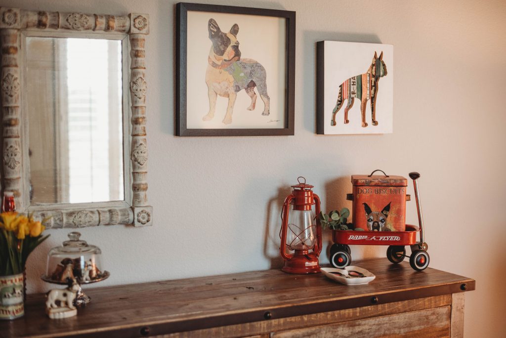
(I played around with this dresser display a little. Which do you like best–wagon or no wagon?)
#4 The Rule, sort of, about MATCHING
Designers get a lot of pushback about matching. “Shouldn’t those pillows (tables, lamps, pictures, whatever) MATCH?” I answer “Maybe.” The important thing is that SOMETHING should tie things together. The room may call for the symmetry of an actual match. Then again, it may need simply a repetition of the color(s). Or shape, or finish, or just the vibe!
Take Melinda’s dresser vignette as an illustration. Should the frames match? Well, they should TALK to each other in some way. In your house, maybe nine same-size botanical prints, or six black and white family portraits might benefit from the same-mat-and-frame treatment. Why? Because they’re probably going to be hung closely together and be viewed as a single unit. Here, though, the black and white of the dog prints-as well as the subject–unifies them. The white also picks up on the white in the mirror frame.
While we’re at it (no extra charge), do you notice that the dog prints together balance the heavier visual weight of the mirror? It’s about balance, not matching. And the mirror’s distressed finish relates to the aged appearance of the dresser. All these little things work together to keep your eye moving and to create a happy harmony in the room!
Ohhhhhhh. Sometimes you just need a designer to help you with these things. Let’s talk!
Have some questions? No problem! I offer a complimentary, no-strings-attached phone call consultation.
Email me to book a call time–and let’s start making design fun!
