Courtney Warren is a Texas-based interior designer whose work has been featured in Real Simple, Better Homes & Gardens, Good Housekeeping, Apartment Therapy, and Today.com. She is a frequent consultant on Fox 4 TV’s Good Day program in Dallas, was ranked in the top 3 percent of interior designers in the US by Houzz.com, and starred in the Dallas episode of TLC’sFour Houses. She delights in helping overwhelmed clients create beautiful spaces—and will never turn down a warm chocolate chip cookie or Diet Dr Pepper.
Shop the projects
My Go-To design accessories
A Stunning 1980’s House Remodel
A Stunning 1980’s House Remodel. This 1980s home had great bones—but its dark wood walls and tired fixtures were hiding all the charm. Our client dreamed of a bright, happy space with modern style and playful, confetti-colored touches. So, we rolled up our sleeves and brought her vision to life! With a mix of timeless updates and fun prints, we turned this dated home into a cheerful, functional space that feels just right for her family.
’80s decor trends haven’t left us just yet! Think shiny brass metals, pastels, oversized tropical prints, and Southwestern themes. Though our client’s home didn’t showcase these classic 1980’s elements (just yet), we immediately saw its potential. Here’s how we completed her house remodel!
This 1980’s home had simple lines and thoughtfully crafted details.
BUT, we couldn’t see its vintage charm without lifting a few hammers.
Its dark wooden walls and rusty light fixtures left our client feeling hopeless. How could she transform her home into a living space that functioned well for her family? AND matched her cheery personality?
That’s where we came in!
She wanted a modern, timeless style with fun, confetti hues, and prints. We couldn’t say no to that! Here’s how we hand turned her house remodel into modern vintage charm:
When our client approached us about her project, she was going through a tough time in her life. She lost a family member. She was working crazy amounts of overtime at her healthcare job and felt burnout. We wanted to be mindful of that.
Design is much more than making things “look pretty.”
It can be a fresh start for someone or a way to cope with stressful times.
If your spaces resonate with your personality, you’ll have a place to unwind. Nothing can quite relax you from a lousy day like coming home to your restful retreat. Yes, your home should make you FEEL GOOD—no ifs, ands, or buts.
So, we sledge-hammered closed-off rooms and refreshed dark stained wood trims. Our goal? Transform this space from sad to OPEN and bright.
It was time for a fresh start. We were thrilled our client allowed us to create a blissful home for her.
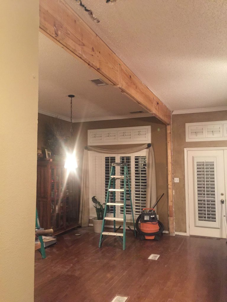
Demo during house remodel
We first broke down the wall between the living room and breakfast nook to take away that drabby feeling. When that wall came down, the light streamed into the whole space!
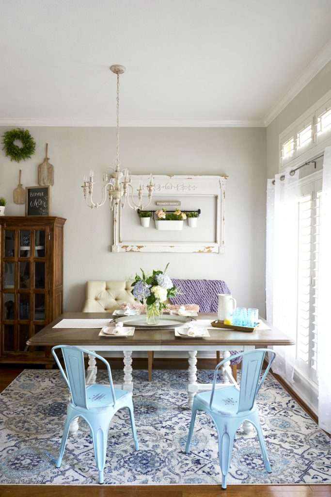
This new look has a fresh feel. Since most of us start our days in the kitchen, this now functions as a cozy morning cocoon. To keep the happy vibes going, we choose a light neutral paint.
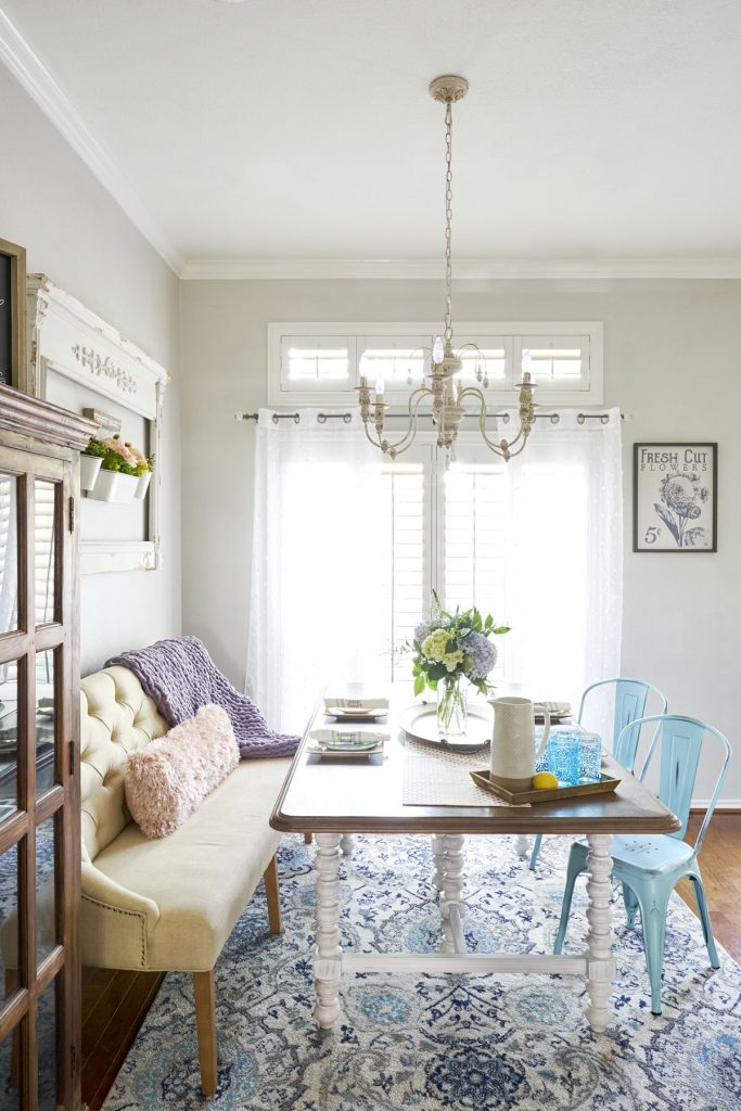
We also hand-picked a vintage glam chandelier to hover over a pretty farmhouse table. This table extends out as well, perfect for seating extra bums. We kept the great plantation shutters for privacy but installed white gauzy curtains.
To tie the space together, we added a patterned blue-toned rug for some underfoot softness and a punch of color. By taking down the wall, we opened the view into the living room. For this reason, we LOVE creating open space concepts. Now, my client can watch her morning show while prepping breakfast.
We also mixed comfortable, playful seating. Here, we combined industrial farmhouse Tolix style chairs with an upholstered settee trimmed in chrome nailheads.
Keeping the House Remodel Open and Bright
Here’s a view of the living room from the dining table. It gives us all kinds of happy and comfy feels. How about you?
Here’s the before: 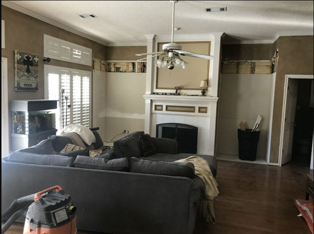
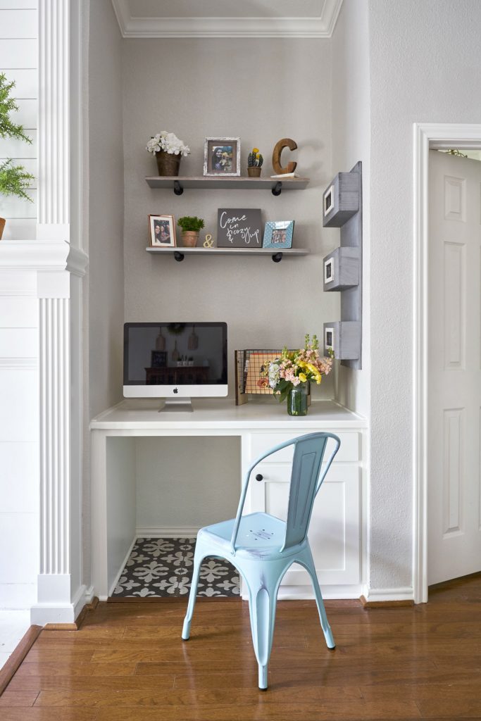
You can see how the deep brown paint made the space feel closed in. We also tore down the built-in bookcases to house a custom media center and TV. On the right end, we transformed the space into a functional mini-office. This computer station provides bonus organization.
More changes to the 1980’s House Remodel
The fireplace molding did not align with our client’s style. We tossed the bulletin board, too.
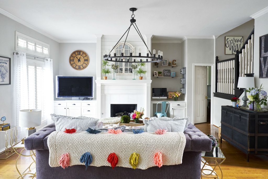
Instead, we installed a white shiplap above the fireplace. We also found the aquarium a new home, which gave us more useable square footage! To save more room, we exchanged the big sectional for a purple velvet chesterfield.
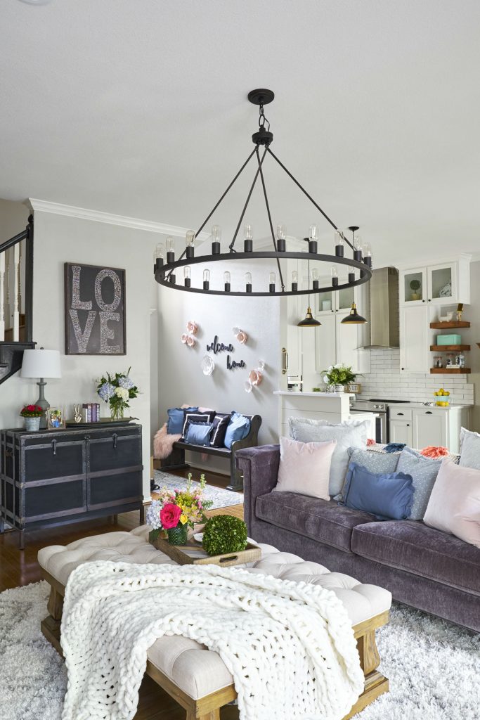
AND goodbye, dated ceiling fan, and light! Hello, gorgeous black iron chandelier with retro bulbs.
To balance the bright colors, we added more subtle black touches to the ground this space.
How many black elements do you see?
We counted 5!
1. Black banisters (formerly–you guessed it–stained wood)
2. Trunk chest console
3. Love artwork
4. Entry bench
5. Kitchen island pendant lighting
Let’s get comfy
My client and her daughter chose pastels for accents. We adore pastels too. The hints of blue make this space feel calm and inviting. And pink? Just for a splash of fun! We still focused on soft textiles for the living room. The velvet sofa, plush throws, tufted ottoman, and shag rug–all up the cozy factor. Family night or formal get-togethers? This space can entertain both.
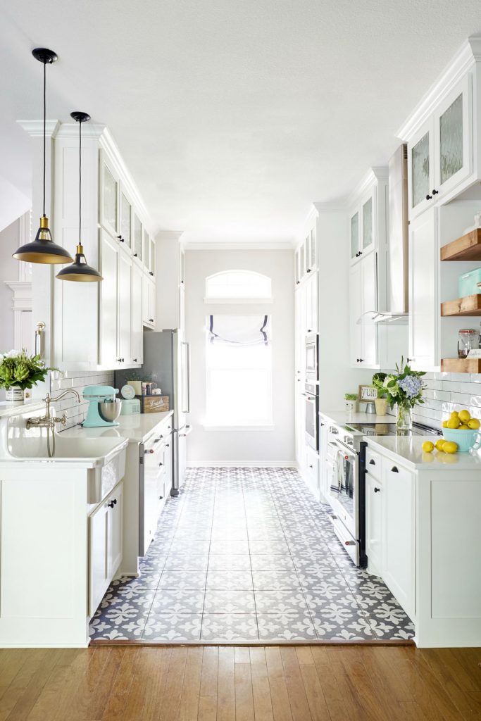
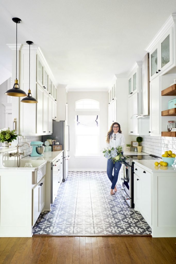
Galley kitchens are perfect for home plans that have less real estate to work with. This doesn’t mean that these kitchens can’t be super functional and good looking.
Tips on how to maximize a small, narrow kitchen.
Tip ➊ White cabinets
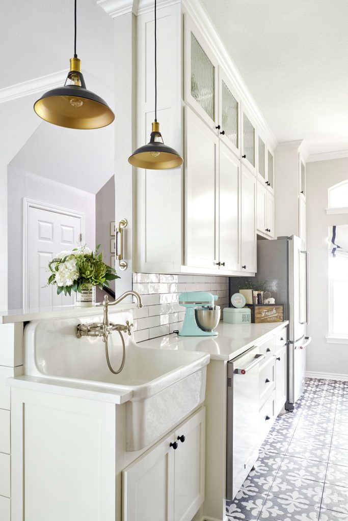
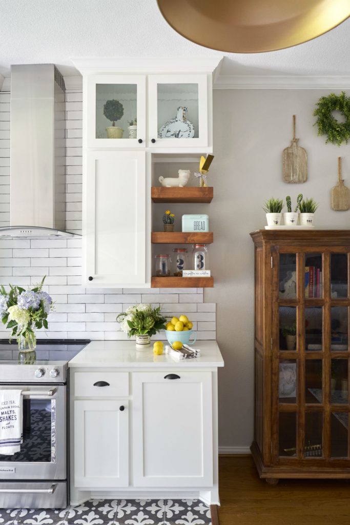
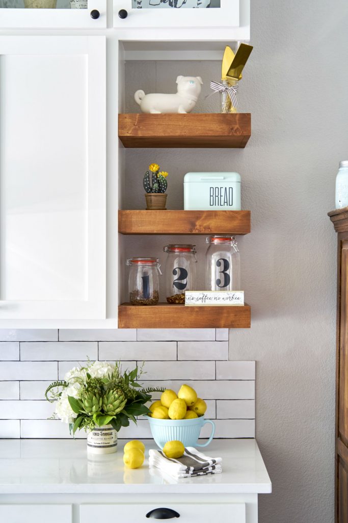
Dark colors absorb light. White reflects light. If you’ve got a big kitchen, you can get away with dark wood cabinets–or even the new dark blue or green options. BUT, to make this kitchen appear bigger (without changing the footprint), we installed white shaker cabinets. Extending these cabinets to the ceiling creates an illusion of an oversized kitchen. To keep the look light and open, we installed glass doors in the topmost cabinets and used some open shelving. More pretty storage? Yes, please.
Adding a custom roman shade to the window also adds a soft texture.
We’re BIG fans of farmhouse sinks. They’ve got a forward orientation, so you don’t need to lean and strain yourself to rinse your dishes (as you do with traditional sinks). Plus, they’re constructed with deeper basins to hold larger pots and pans–beauty WITH function.
The black and brass pendants add a nice juxtaposition to the white subway tiles too.
Tip ➋ Unify finishes
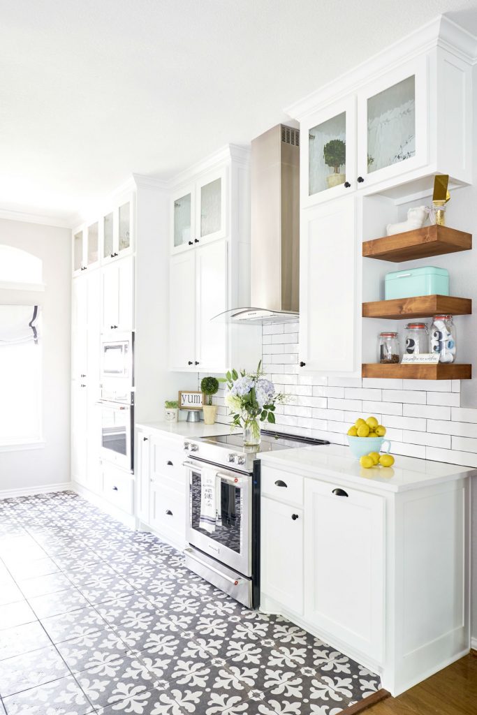
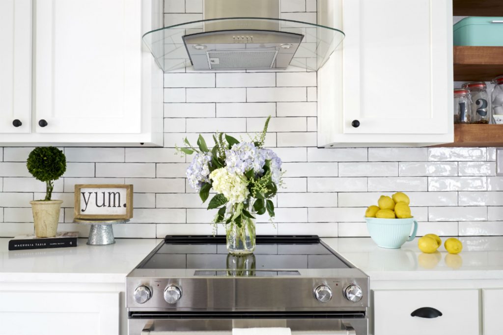
The subway backsplash and new quartz countertops complement each other. Quartz is an excellent alternative to granite because it doesn’t absorb bacteria and does not require resealing every few years. AKA, if you spill some turmeric on your counters during curry night, you’ll be fine.
Tip ➌ Appliance Refresh
Adding new stainless steel appliances always adds a nice, modern touch. Taking the backsplash and stove vent to the ceiling also creates high style.
Tip ➍ Artsy Tile
If you’re also looking for instant gratification, changing your builder’s tile is the way to go. Here, we installed handmade cement tiles in a black and white finish. Since we didn’t have matching wood flooring where we took out the built-ins, we used this same tile under the computer station. Bonus: doing this ties the two areas together and creates a cohesive look.
We also installed floating shelves to stage family photos and accessories. In the mini office, we used industrial shelves, and for the kitchen, we chose honey- stained wooden shelving for an earthy look.
Bedrooms?
Yes, we designed those too! We’ll share the nitty-gritty details in a future post. Can’t wait? Take a peek at this project’s full gallery here.
After we finished our client’s house remodel, she told us, “I’m fixing dinner for my daughter, and for the first time, this feels like home.” What more could a designer hope to accomplish!
Has your home stayed in the 1970′ s-80’s-90’s for too long? We’re confident your family can benefit from a house remodel. If your current home needs an update OR if you’re on the fence about buying a fixer-upper, we can help. Let’s chat!
EMAIL ME TO BOOK A CALL TIME!

Do you want up your design skills?
Is your favorite style now out of date?
Find out here…
What Other People are Reading…
RoundTop Antiques Week in Texas 2026: Where to Stay, What to Bring, and How to Shop It Well
Everyone talks about like it’s just a shopping trip. It…
How to Shop at Round Top Antiques Week in Texas: Part One
No one really explains Round Top Antiques Week properly. Most…
3 Rooms in Your Home that Need Refreshing in the New Year
There is something wonderful about a clean calendar page. It…
6 Interior Design Trends for 2026 You Should Know About
Every year, interior design shifts just enough to make us…
3 Christmas Table Settings to Try This Holiday Season
Christmas table settings are one of my favorite parts of…
