Courtney Warren is a Texas-based interior designer whose work has been featured in Real Simple, Better Homes & Gardens, Good Housekeeping, Apartment Therapy, and Today.com. She is a frequent consultant on Fox 4 TV’s Good Day program in Dallas, was ranked in the top 3 percent of interior designers in the US by Houzz.com, and starred in the Dallas episode of TLC’sFour Houses. She delights in helping overwhelmed clients create beautiful spaces—and will never turn down a warm chocolate chip cookie or Diet Dr Pepper.
Shop the projects
My Go-To design accessories
Wallpaper to Wow: This Bedroom Was Aged 20 Years
Last time I showed you pix from my Plano clients’ home and how my team and I did a major refresh number on the living room and sitting room. See it here.
These lovely folks had asked me to help them re-imagine their dated, formal style and bring in a lighter, brighter vibe for their grandparenting years. I was delighted to take this on!
You don’t always have to take down walls to up your home’s style and function factor. Sometimes you just need guidance about paint, strategic furniture purchases, and accessorizing.
The master bedroom benefited from those very things!
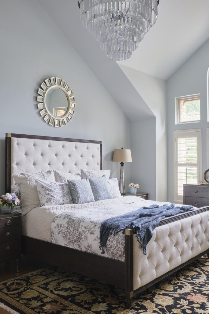
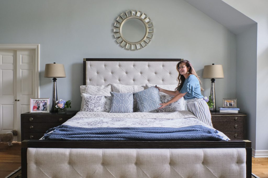
Who wouldn’t say this master is a stunner? From the lovely pale wall color to the gorgeous chandelier to the ooh-la-la upholstered bed, this new suite is now living up to its style potential. Like waking up in a posh hotel every day!
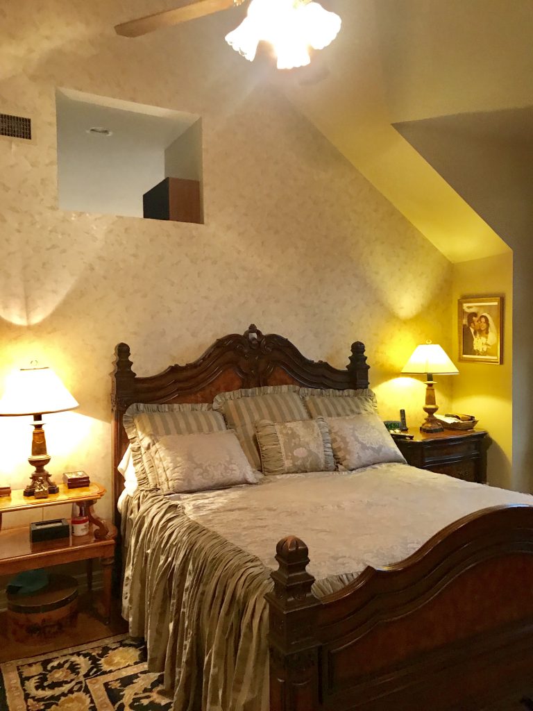
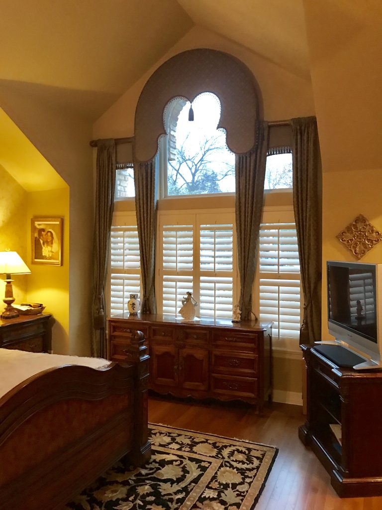
To fully appreciate its new personality, you must see the before pix below.
What’s up with the hole in the wall? Who knows? It was one of those 90’s builder ideas.
During our consultation, the owners agreed that the heavy baronial furniture was dragging the room down. Ditto the wallpaper and dated bedding and paint. And although the elaborate curtain treatment had had its day, it was time to open up those great windows and allow the light in!
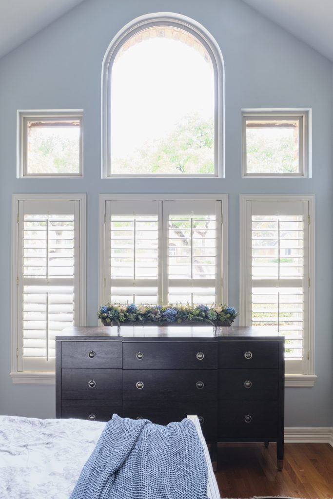
And so we did! The crisp plantation shutters still protect privacy, but behold the natural light!
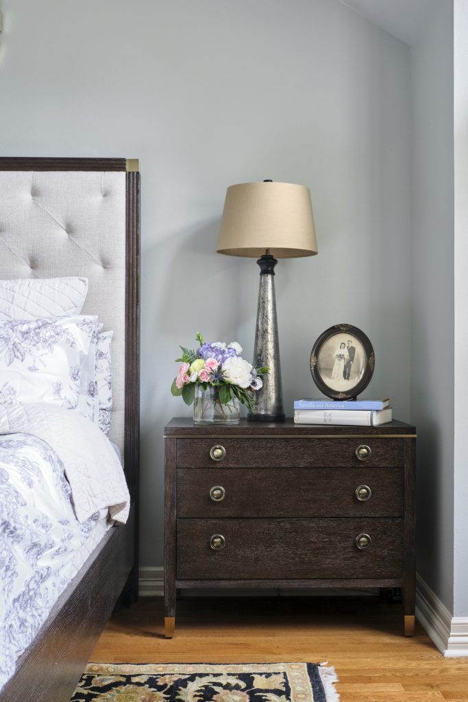
Ah, that was then, this is now. The new transitional furniture is so smart and timeless! Those modern mercury glass bedside lamps were just the jewelry this space needed, and their height fits perfectly with the tall headboard. We chose a tall headboard and added the classy mirror above to keep the grouping from being dwarfed by the very tall ceilings. Do you think about the scale of your furniture in your rooms? You should!
So of course we drywalled over the hole in the wall (duh) and then repainted in a beautiful neutral blue-grey. Notice we kept the clients’ rug and incorporated the black into the new scheme with a fresh take on black and white toile bedding.
Our style preferences evolve over the years, and that’s ok. When you feel that your decor is needing a wakeup call, let’s talk!
Have some questions? No problem! I offer a complimentary, no-strings-attached phone call consultation.
Email me to book a call time–and let’s start making design fun!
