Courtney Warren is a Texas-based interior designer whose work has been featured in Real Simple, Better Homes & Gardens, Good Housekeeping, Apartment Therapy, and Today.com. She is a frequent consultant on Fox 4 TV’s Good Day program in Dallas, was ranked in the top 3 percent of interior designers in the US by Houzz.com, and starred in the Dallas episode of TLC’sFour Houses. She delights in helping overwhelmed clients create beautiful spaces—and will never turn down a warm chocolate chip cookie or Diet Dr Pepper.
Shop the projects
My Go-To design accessories
Decorating Boys’ Bedrooms and Guest Spaces for Summer!
After a year of planning (and editing plans), picking finishes, and driving our contractor pretty crazy, we are finally in our new house! Today I’d like to show you how to I decorated the boys’ bedrooms–and (a first for the Warren houses) a guestroom!
We haven’t had the boxes unpacked for long, but I still wanted to make each of the boys’ rooms welcoming and an expression of their personalities. Don’t make the mistake of thinking, “Oh, I’ll get around to those kid rooms sometime…” Really, they deserve a happy space that’s just for them!
Will a kids’ wallpaper look dated quickly?
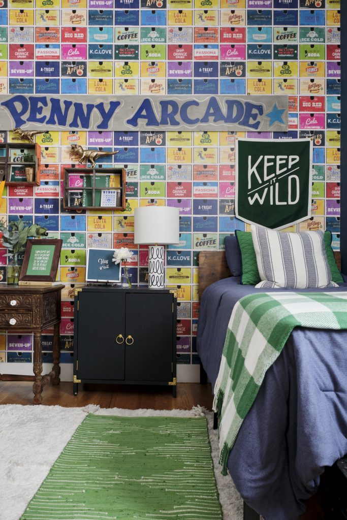
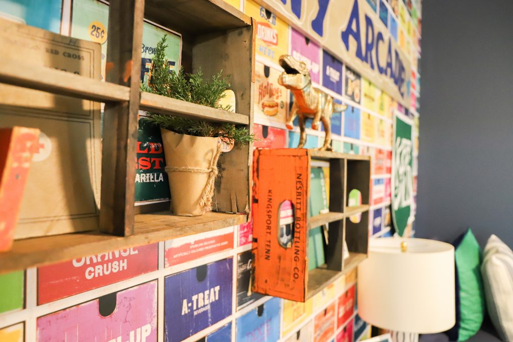
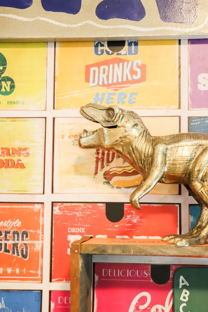
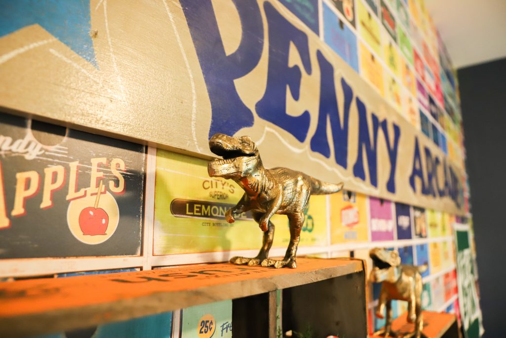
For our younger son, I definitely wanted something colorful in his bedroom, something that he’ll like as he grows older. And he’s a fun and funny kid, so he needed something with spunk. When I found this vivid pattern of vintage soda pop crates by Milton & King Wallpaper, I thought it was perfect. It’s nostalgic and retro, just right for my youngster to grow with.
If you’re thinking of using some of the new wallpapers in your home, the question that’s bound to surface is:
Should I wallpaper the entire room, or just one wall for an accent?
The answer is going to depend on several factors, not the least of which is the scale and pattern of your paper. Are you trying to create a cocoon effect by covering all the walls, or simply make an accent to direct your eye, echo your colors, or set your theme? What other elements in the room will be fighting for your attention?
In our young boy’s room, the paper had a LOT going on! So I chose to paint a navy wall and use our bright soda crate paper on another wall. And our little guy loved the effect! In fact, he walked up to the papered wall and tried to open one of the crates like a drawer, they were that realistic! Ha ha!
Can I hang wallpaper myself?
Now, you may be very handy or a seasoned veteran when it comes to wallpaper, but me–I have my wallpaper installers on speed dial. They found this great quality paper quite straightforward and easy to hang.
What do you think of Abe’s room? I must say I’m a fan! This paper’s lively pattern and cheery colors instantly brightened up the room and created a wow factor. It’s the first thing you see in the room, and it brings in a ton of color and fun!
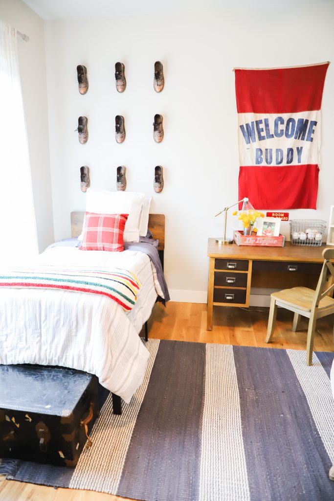
How do you decorate for a teen boy?
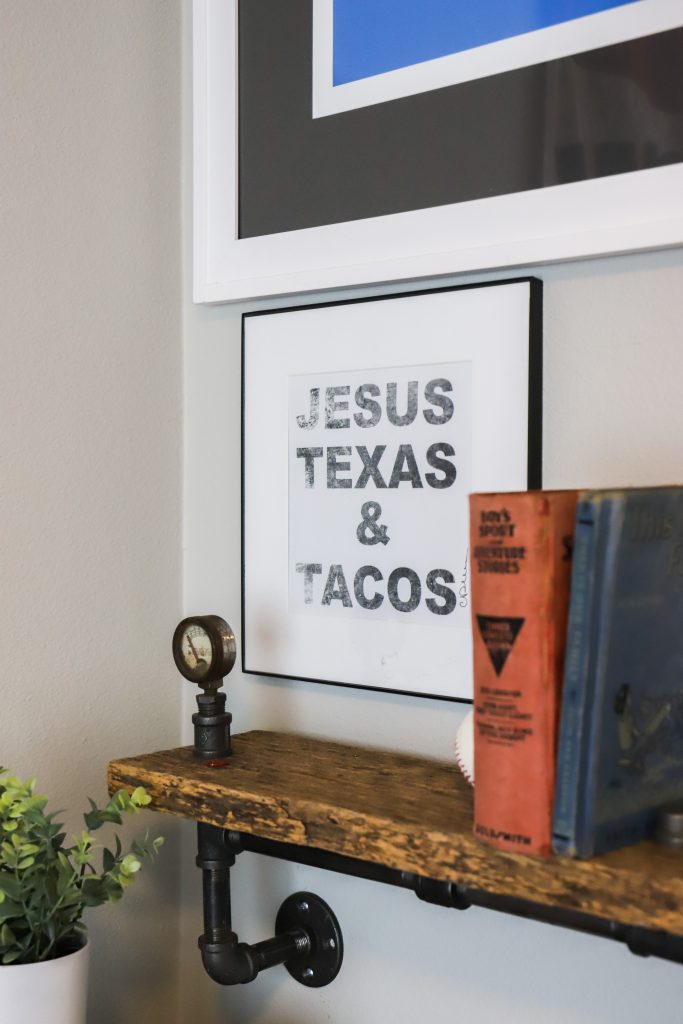
Judah’s room presented a few more challenges–he’s a teen, after all, and definitely didn’t want anything that screamed “Mom decorated my room”. But I think I was pretty restrained. Simple primary colors in the rug, linens and the graphic flag set a happy note right when you enter. Vintage shoes in a grid pattern extend the look of the simple twin headboard upward. Plain pipe and board shelving hold Judah’s books and keepsakes, and some vintage locker baskets and baseballs reflect his love of sports.
Since all the electronics are downstairs in the common spaces, all he really needed in his bedroom was a place for sleeping and a quiet spot for studying.
The last room on today’s tour is our guest room!
Finally–a guest room!
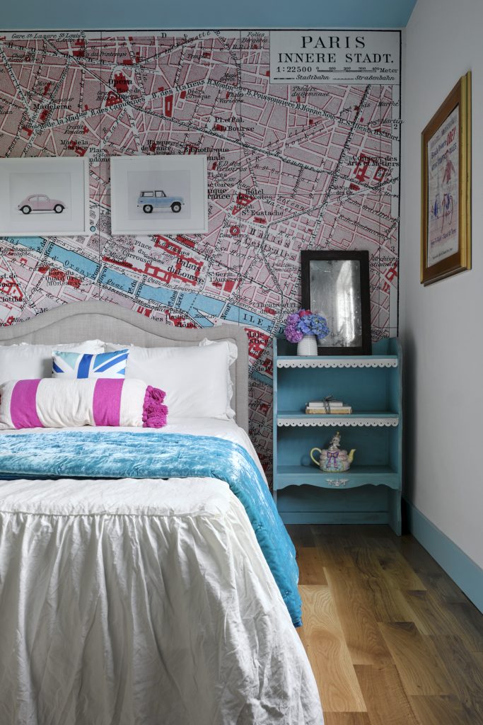
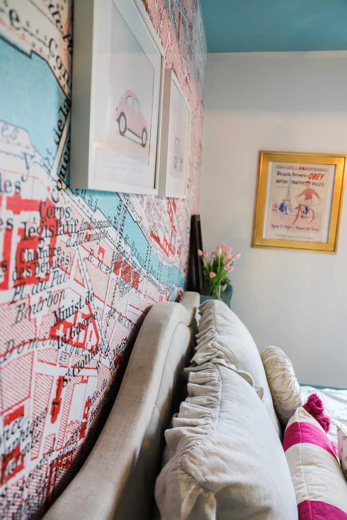
I am so thrilled to finally have a guest room, and wanted to create a space that felt like a peaceful getaway and a happy place to land. My best friends from college live all over the country, so I was ready to have a spot for them to spread out and stay awhile when they come to visit me.
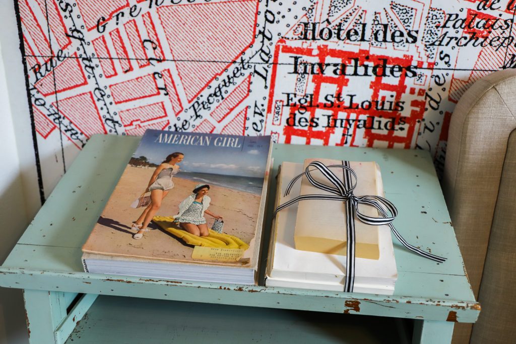
This map of Paris was a perfect backdrop that Wunderwall created custom for the wall. To save money in our budget, we didn’t buy new furniture for this room. But some pieces that we already had worked perfectly!
I hope you’ve enjoyed the bedroom tour. Be sure to check back later to see the master bedroom and bath!
Will you be having guests this summer? Do you have a dedicated guests space? How do you prepare for guests?
I’d love to see your imaginative ideas on my Facebook page!

See other design ideas on my home page courtneywarren.com and on Instagram @courtneywarren
Got a remodel project in mind? Let’s connect!
As always, I am happy to guide you on your design journey. We’re all about designing for real life. We want your home to work well for you and your family. Good design always incorporates BOTH beauty and function!
I offer a complimentary, no-strings-attached phone call consultation.
EMAIL ME TO BOOK A CALL TIME!
