Courtney Warren is a Texas-based interior designer whose work has been featured in Real Simple, Better Homes & Gardens, Good Housekeeping, Apartment Therapy, and Today.com. She is a frequent consultant on Fox 4 TV’s Good Day program in Dallas, was ranked in the top 3 percent of interior designers in the US by Houzz.com, and starred in the Dallas episode of TLC’sFour Houses. She delights in helping overwhelmed clients create beautiful spaces—and will never turn down a warm chocolate chip cookie or Diet Dr Pepper.
Shop the projects
My Go-To design accessories
4 Changes Your Living Room Needs Now
You don’t have to tell me, I KNOW why that living room makes you NOT want to ask folks over:
It’s drab and dated.
The furniture is still where the store delivery guy set it down 10 years ago.
And the room doesn’t even work for your family, let alone guests.
But change is possible! My client’s home had all these issues, but with a little vision, we transformed it into the welcoming, cozy, functional space she’d hoped for! Look at the befores and afters and begin to visualize how these changes could work for YOUR tired living room. I would love to help you!
1. First impressions
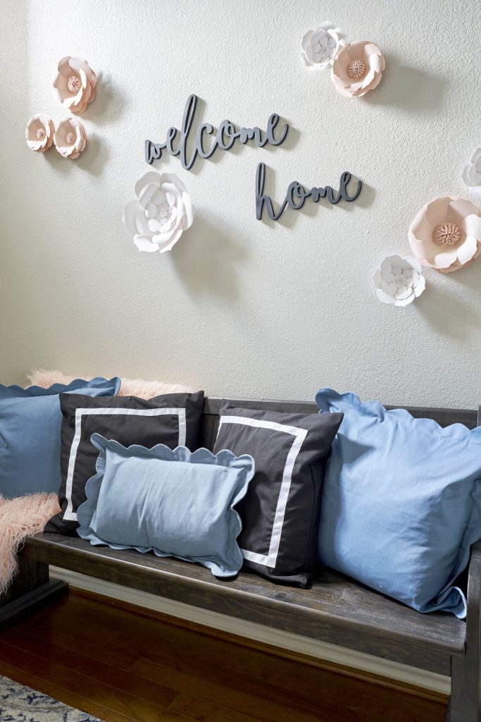
Question: does the entry to your home say “Welcome”? Maybe not with words, like in my client’s revamped foyer, but how about with a bench or coat rack for your guests’ convenience, or even a pretty vignette on a table top? These small details draw family and friends in and say, “I’m glad you’re here!”.
2. Let there be light!
The first thing we did here was to take down a wall between the dining room and living room to make one open family/guest space. Now the room is flooded with sunlight. To further brighten, we repainted with a lovely pale grey and used bright white trim. Even the side tables are visually light, with mirrored tops and slim brass bases.
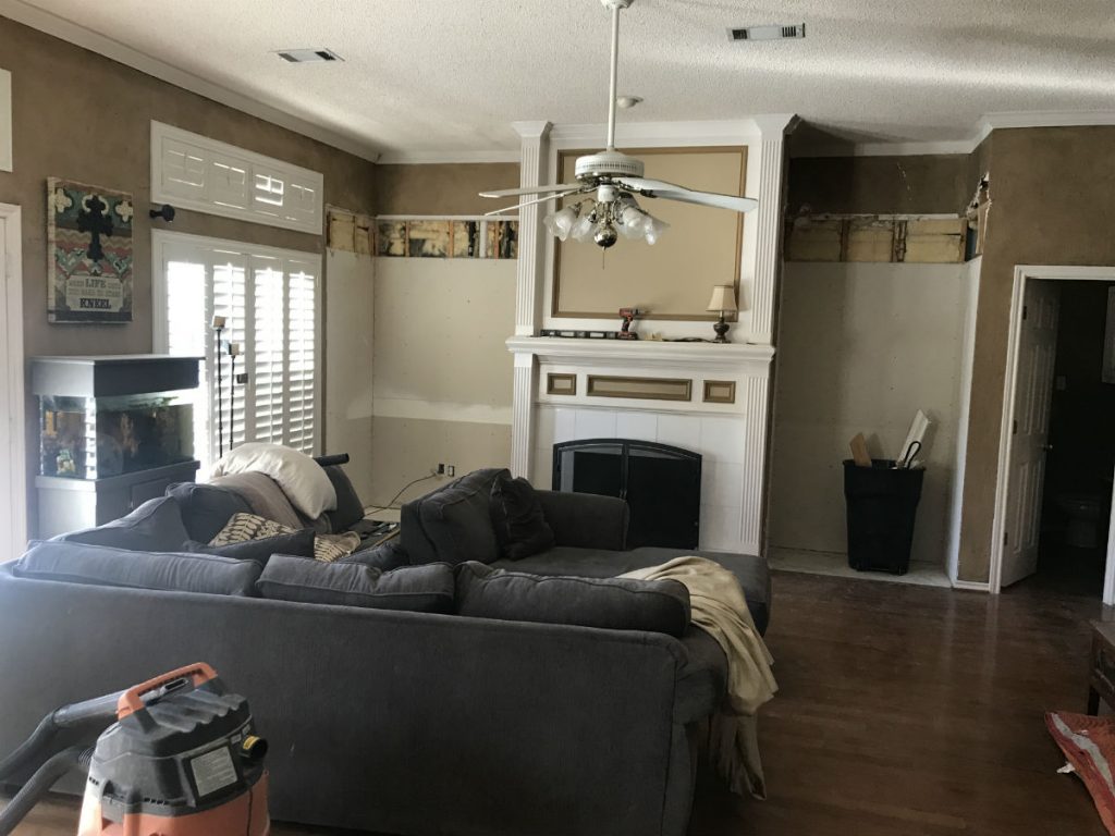
Just check out the before pics to see how much difference light makes! Brown paint? Gone. Wood paneled built-ins? Gone. Wood banisters? Gone. The room looks twice as big with light, fresh finishes! (Maybe you need to start dreaming with some paint chips in your hand!)
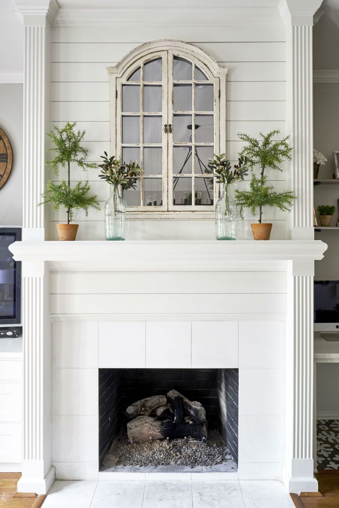
No more awkward “bulletin board” molding on the fireplace. The white shiplap is soooo much better, and the paned mirror (you got it) reflects light into the room!
3. Define function
Yes, we tore out the paneled built-ins flanking the fireplace to be able to sheetrock and repaint, but also to convert the nooks into useable real estate. The family didn’t NEED double bookshelves, but they did need a computer workstation, a TV niche, and closed storage. So that’s what we gave them.
When your space isn’t working for you, change its job description.
White cabinetry now brightens the room and visually ties into the kitchen, which you can see from the living room since the wall is down. Even the patterned tile in the knee hole is the same as in the kitchen. Cute touch–and it solved the problem of matching the wood floor!
4. Improve flow
Furniture arrangement can really open up your room’s flow. And sometimes we try to cram in too much furniture. Trading out a space-hogging sectional for a large velvet sofa and upholstered ottoman made more sense for this family. The ottoman provides extra seating when needed, but is also a perfect place to put feet up and hold the popcorn bowl on family movie night. The large aquarium moved out of the living room.
(So, think: maybe that scrapbooking table in your living room needs to find a new home?)
My client is delighted with the light, happy vibe and wonderful flow of her home now. It finally reflects her personality and suits her family’s lifestyle. Steal these ideas to breathe new life into your blah family spaces!
And if you’d like further help bringing your living room back to the land of the living, let’s talk!


