Courtney Warren is a Texas-based interior designer whose work has been featured in Real Simple, Better Homes & Gardens, Good Housekeeping, Apartment Therapy, and Today.com. She is a frequent consultant on Fox 4 TV’s Good Day program in Dallas, was ranked in the top 3 percent of interior designers in the US by Houzz.com, and starred in the Dallas episode of TLC’sFour Houses. She delights in helping overwhelmed clients create beautiful spaces—and will never turn down a warm chocolate chip cookie or Diet Dr Pepper.
Shop the projects
My Go-To design accessories
From Dated to Updated: 2023 Refresh for a Tired Space
We grow, we change, and our style sensibilities do, too. I get more than a few calls from homeowners who–although they can’t or don’t want to jettison all their furnishings–are in desperate need of a major refresh. My clients in Plano were among them.
They are at a time in life, welcoming grandkids into the house, when suddenly much of the decor they’d always liked felt too dark, too stuffy and formal. They wanted some fresh breezes to blow through the house. Well! I’m the girl for that job!
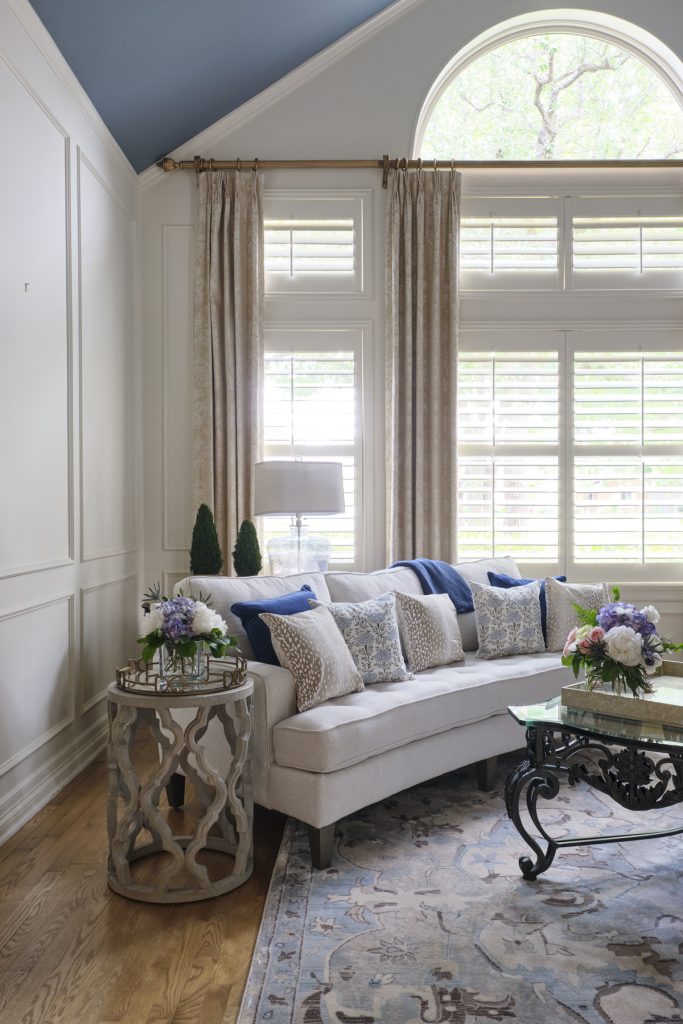
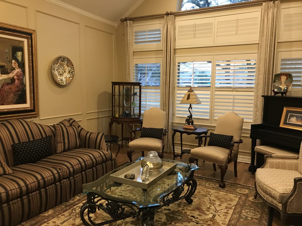
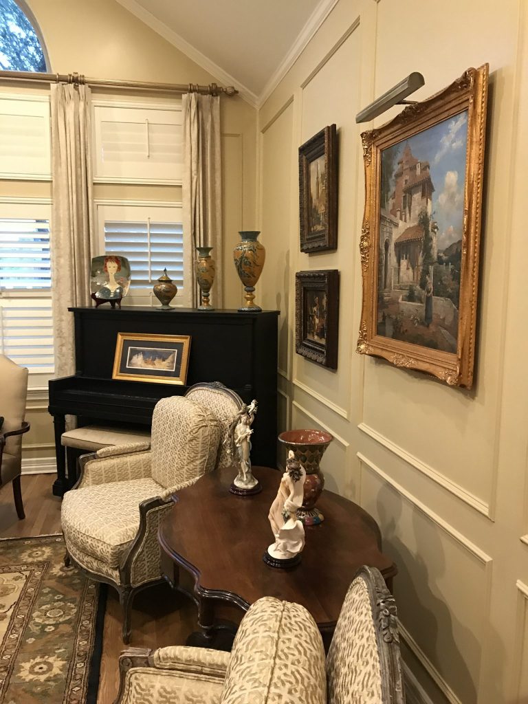
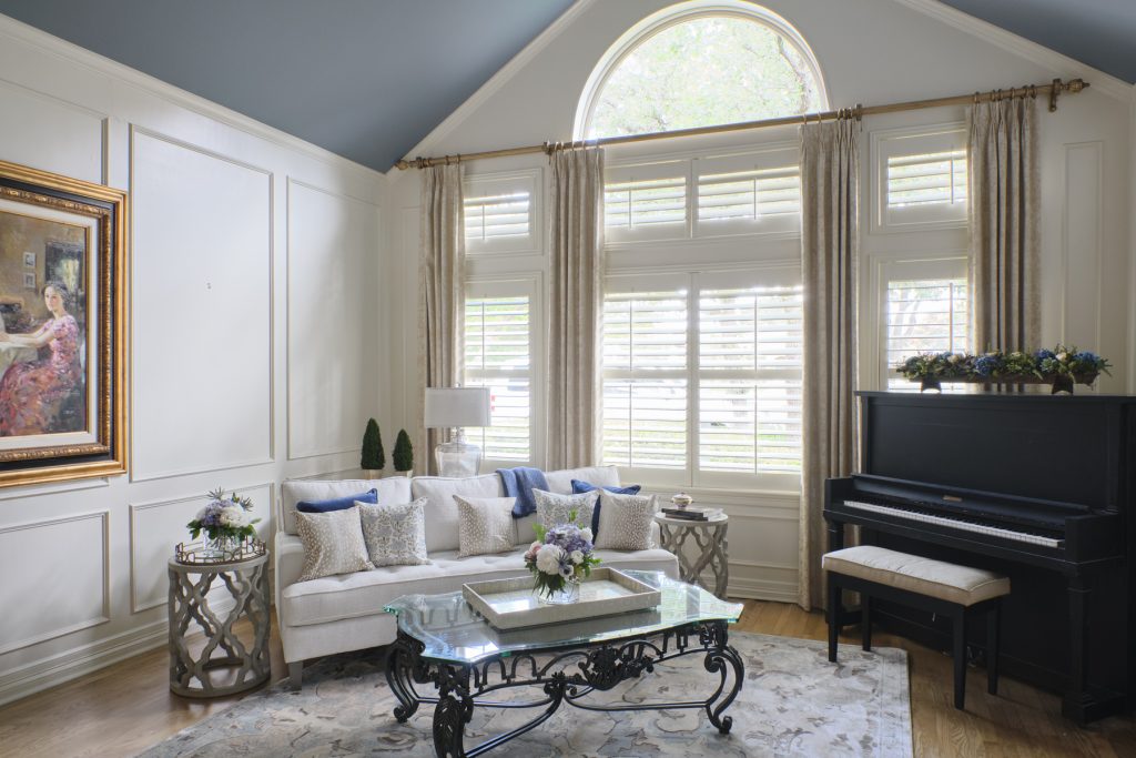
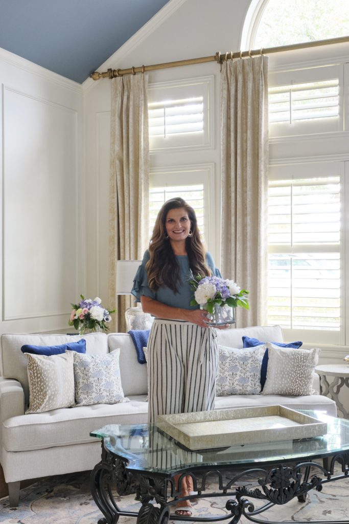
Ahhh, lighter and brighter! To appreciate the changes to the formal living room, see the before photo below. We not only lightened the room’s paint color to a classic white, we painted that beautiful vaulted ceiling–gasp–BLUE! It was a bit of a stretch for the homeowners to embrace my idea, but once they saw the result, they LOVED it. Also, mixing in some not-so-traditional furniture pieces toned down the formal vibe.
Here’s a decor tip: you don’t have to change everything to update your look. If you have a piece that you love or that you’re invested in and it’s really hard for you to say g’bye, update the pieces around it–you’ll be surprised what a difference that will make. Surrounding your current furnishings with items that are fresh and current will elevate the existing pieces!
At my direction, the clients edited their furnishings and made room for some new pieces, like the off-white sofa. The pieces they kept, like the iron and glass coffee table, were ones that they really liked. The artwork in the home was also seriously pared down to open up white space and let the rooms breathe. Less really is more!
Moving some items out made room for an important change: rearranging the furniture. We knew we wanted to open up the space but didn’t know exactly what we were going for, so we just started moving and angling until we liked the result. Sometimes you can work things out on paper, sometimes you just have to get in there and move things around.
Be gone, browns! The new patterned rug ties in the blues of the new palette. We carried the blue and white scheme into the den, as well, where too much big dark furniture overwhelmed the room. (Is there furniture in your house that you have because, well, you have it? Maybe it’s time to rethink which pieces you really like, use and want to keep, and which can find a new home. I can help!)
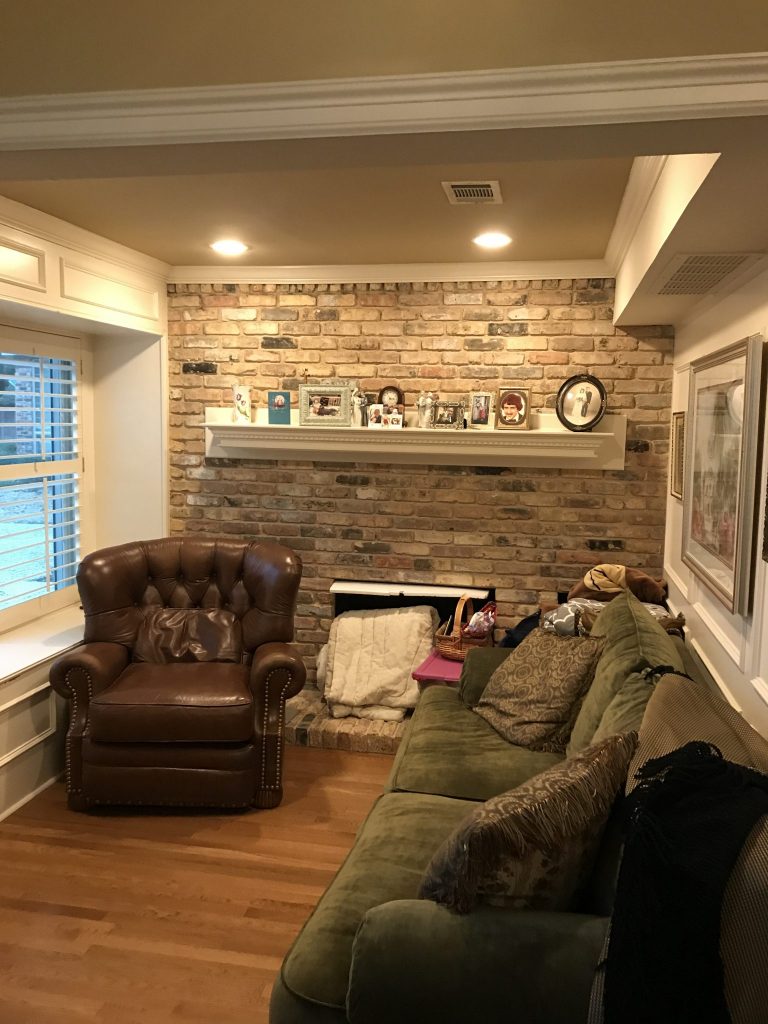
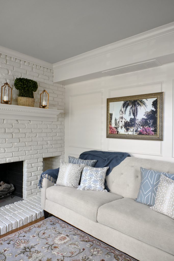
Another tip you can use: painting out the brick fireplace wall with the same white as the walls visually expands the room by eliminating the changes at the corners, which cut the room into segments. Bringing in a light sofa on a smaller scale, and reducing the amount of wall art, also contributes to the illusion that the room is bigger. The grandkid photos found another place of honor, and now the mantle decor is just enough to draw the eye up. A new stylish rug with blues, some pillows and a blue throw–voila!
It was joy to work with these clients to update their lovely family home from traditional to more transitional. Check back soon, because I’m going to show you what my team and I did in the master bedroom and–oh my goodness!–the darling grandkid playroom/bedroom.
A fresh pair of eyes can make all the difference to your decor. So let’s talk!
Have some questions? No problem! I offer a complimentary, no-strings-attached phone call consultation.
Email me to book a call time–and let’s start making design fun!
Stunning. Love that ceiling in blue.