Now, you may think you know what a “modern” house looks like. Or say, a “farmhouse”. But if we throw “eclectic” into the mix, am I really messing with your head? Trust me, the results we achieved in my clients’ home with this gorgeous style mash-up speak for themselves. Walk with me through some befores and afters–and prepare to be inspired!

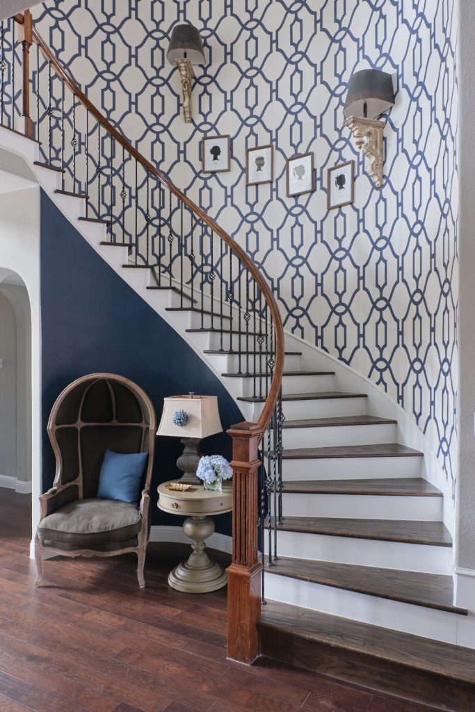
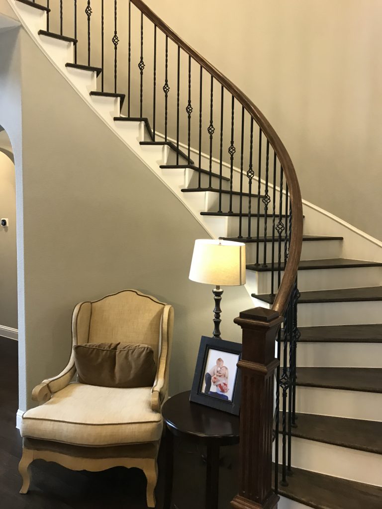
You know wallpaper has taken a resurgence, right? And I find it such a fun way to add interest to interiors! We knew when we found the right pattern and scale wallpaper for this two-story entry and curving staircase that it would be a show-stopping centerpiece for this gorgeous home. And what a difference from its bland beginnings. Sha-ZAM!
Entry/stairway before:

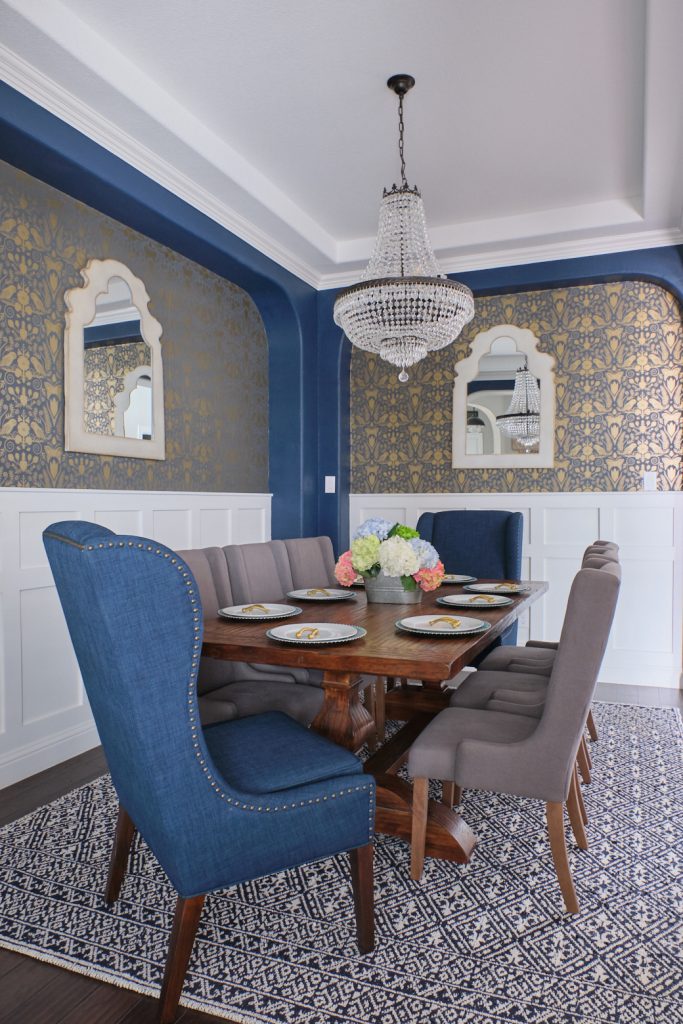
I drew inspiration for the blue color scheme throughout much of the house from the beautiful patterned dining room rug my client already owned. She loves blue and has great style, but just needed help pulling it all together. Well, that is what I do!
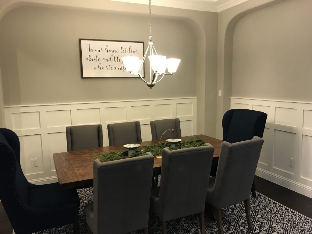
Dining room before:
The owners were so easy to work with and were open to some bold ideas to enhance the good things their home already had going for it.
We started with a basic, lovely dining room–and finished pretty much light years away! Now, because the dining room connects to the entry/stairway, the wallpapers we chose had to talk to each other. I’m thinking we nailed it, what do you think?
Dining room after:
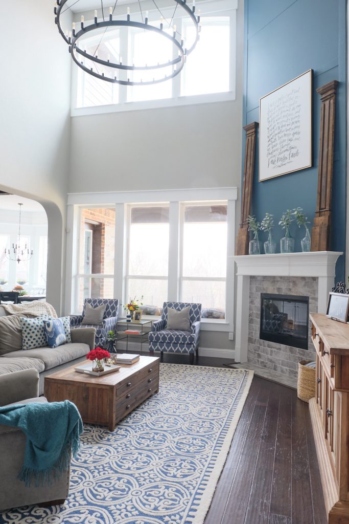
The living room was functional and ok, but we definitely needed to kick it up a notch. We kept the space family friendly, but brought in some punchy design elements like the massive Restoration Hardware iron chandelier and a pair of stylish club chairs, then tied the grouping together with a large blue patterned rug. The mantle benefited from some architectural salvage columns and super-size artwork that help to scale down the two-story chimneypiece.
Living room after:
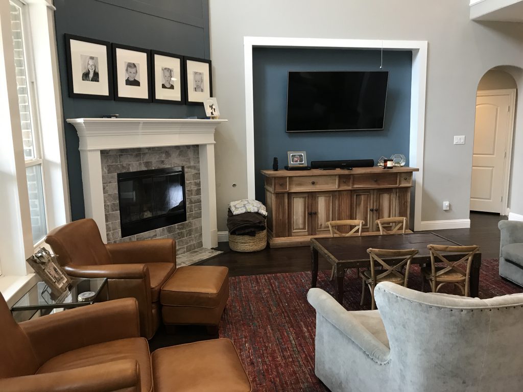
We moved the kids’ table to a new space designed just for them, and the leather chairs found a new home in dad’s newly-decorated office.
Living room before:
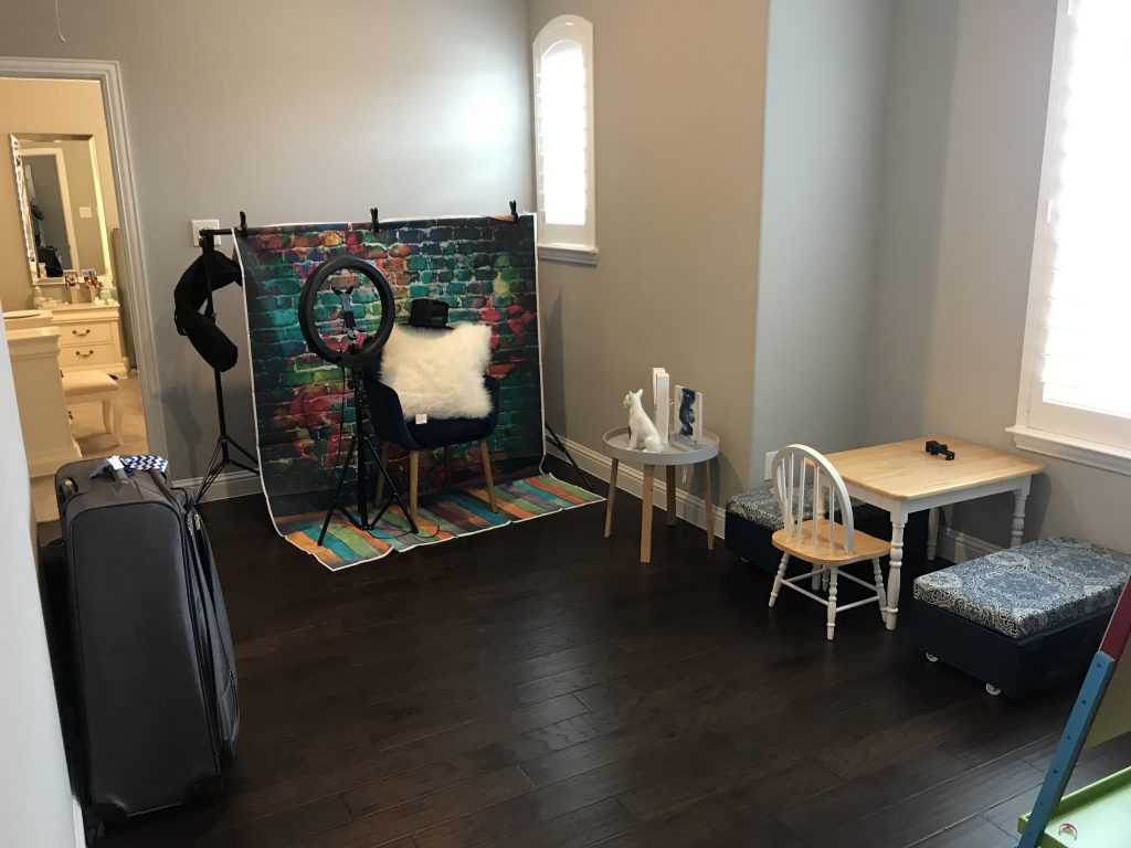
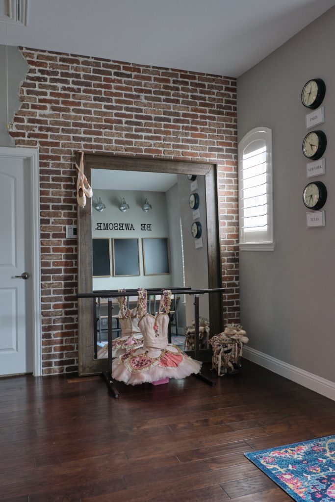
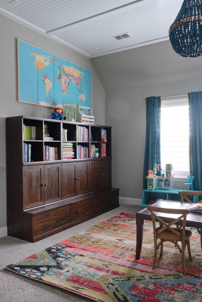
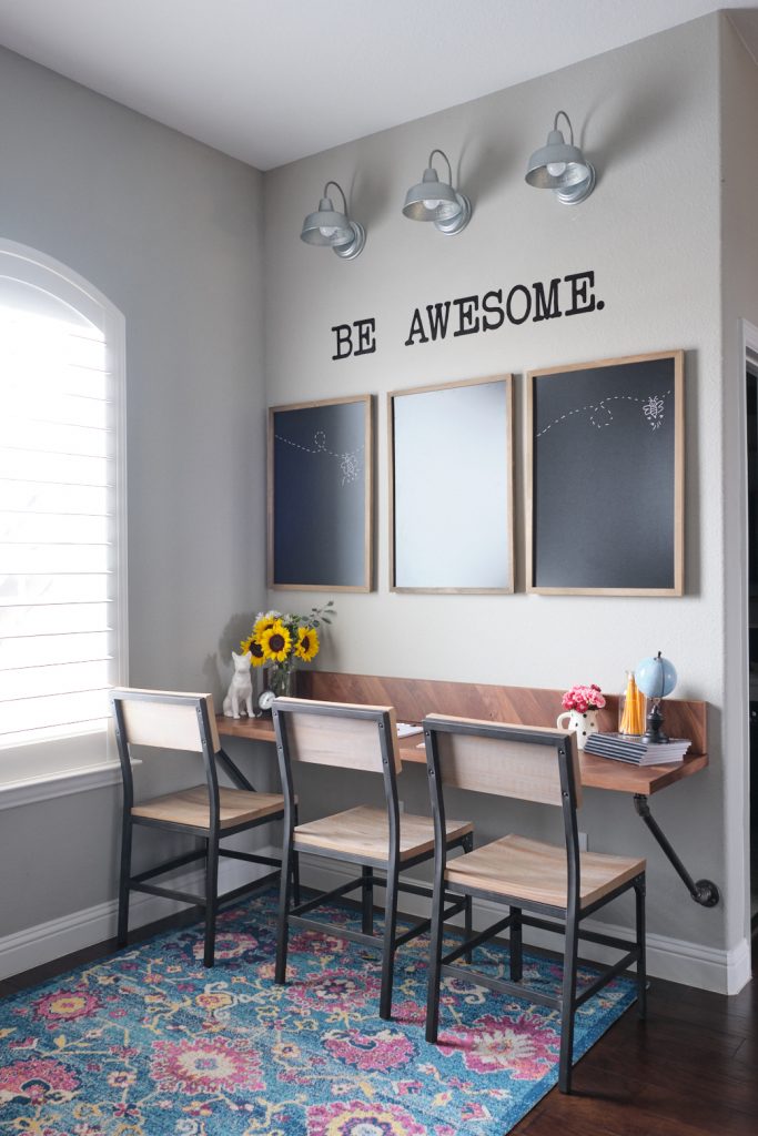
Mom wanted a revamp of the kid space for their four active kiddos, and I was delighted to give them a spectacular playroom that not only looks great but works hard to handle everyone’s interests and activities.
Playroom before:
Playroom after:
For those of you drawn to the farmhouse aspect of this home, you’ve seen that those notes are subtle, and deliberately so. Some tips for using farmhouse style, not fad: use signs sparingly, add personal details (for example, the gallery wall I’ll be showing you in dad’s office), and, by all means, set yourself limits on chickens and windmills.
Well! There’s more to this fabulous home than I can possibly share in one post! I promise I’ll bring you more before-and-afters of this stunning whole-house redo soon. Check back for photos of mom’s and dad’s offices, bathroom, master bedroom, kitchen and mudroom!
Have some questions? No problem! I offer a complimentary, no-strings-attached phone call consultation.
Email me to book a call time–and let’s start making design fun!
