Courtney Warren is a Texas-based interior designer whose work has been featured in Real Simple, Better Homes & Gardens, Good Housekeeping, Apartment Therapy, and Today.com. She is a frequent consultant on Fox 4 TV’s Good Day program in Dallas, was ranked in the top 3 percent of interior designers in the US by Houzz.com, and starred in the Dallas episode of TLC’sFour Houses. She delights in helping overwhelmed clients create beautiful spaces—and will never turn down a warm chocolate chip cookie or Diet Dr Pepper.
Shop the projects
My Go-To design accessories
Ghastly to Gorgeous Galley Kitchen: 5 Tips
Ghastly to Gorgeous Galley Kitchen: 5 Tips. Love your home and your galley kitchen? You don’t have to knock down every wall to make it work! When my client was over her dark, dated space, we gave her galley kitchen a fresh, bright makeover—without changing the footprint. Think white cabinets to bounce the light, sleek finishes for a unified look, and smart storage tricks that make the most of every inch. From ceiling-height cabinets to statement tile and gorgeous new appliances, this little kitchen now packs a major design punch. Want your galley to feel bigger and brighter too? I’ve got tips to help you do just that.
Home plans these days mostly renounce galley kitchens for the “open concept” kitchen with an island. But say you love your home, galley kitchen and all, and want to stay in it. Short of a TV network magic wand “Hey, let’s move your kitchen to THIS part of the house!” -kind of change (read $$$$), there are ways to enhance the appeal and utility of a galley kitchen. Need to know how to make a galley kitchen look bigger?
I can help with that!
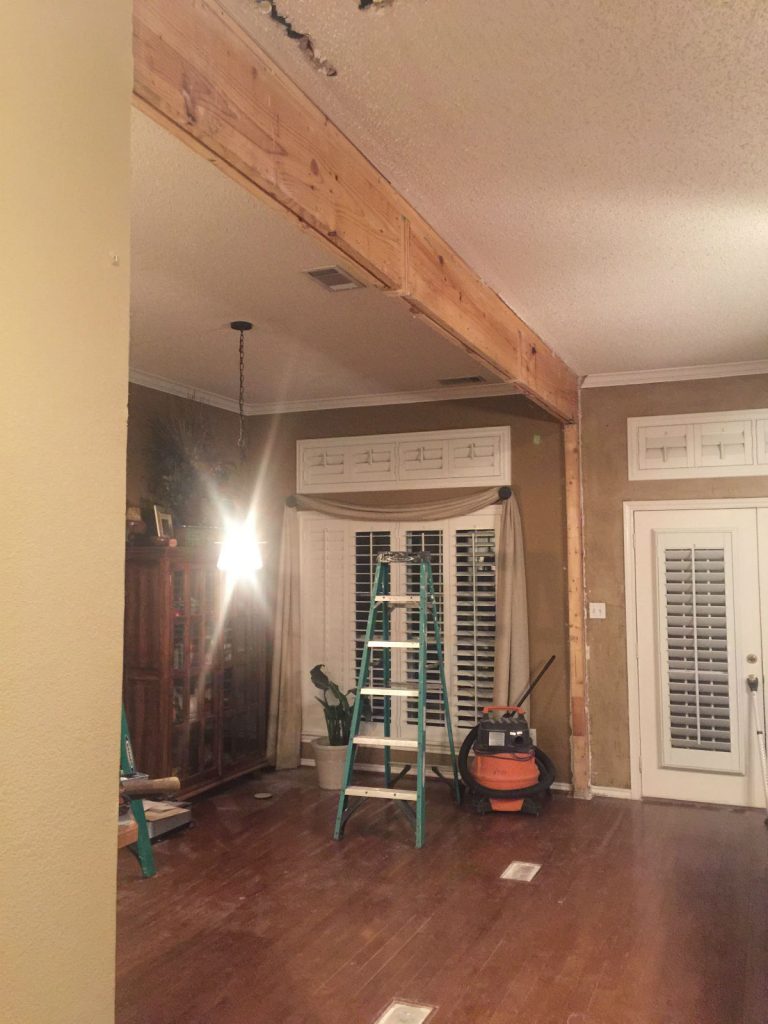
My client had had ENOUGH of her home’s dark, dated kitchen, dining and living room. Last time I showed you how taking down the wall and arched opening between the dining room and living room opened up the flow of this kitchen/dining/living hub.
I know you’ve been dying to see more of her incredible new kitchen!
Ready for tips to make your galley gorgeous?
What are good colors for kitchens?
Are white kitchens out of style in 2020?
Tip #1 – White cabinets
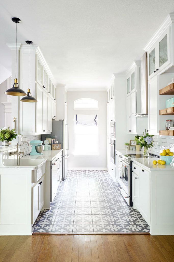
Yes, Virginia, once upon a time everyone wanted stained wood kitchen cabinets. But that was then, and this is now. Dark colors absorb light, but white reflects light. If you have a big kitchen, you can get away with dark mahogany cabinets. But that didn’t work in this galley kitchen. To make this kitchen “bigger” without changing the footprint we brought in new white Shaker cabinets to bounce light all over the room. (The window with its new custom roman shade does the light fetching!)
Do you want to know what kitchen cabinets and popular cabinet colors are in? These are my favorite.
What kitchen trends should I follow and which ones should I avoid?
Tip #2 – Unify finishes
Fresh subway tile on the backsplash and white quartz on the countertops (both glossy white: see “reflected light” in #1) work with the white cabinets for a unified look. When you have a myriad of finishes and colors, the result is choppy–the eye stops to look at every change. The white finishes throughout this kitchen keep the eye moving and create a feeling of spaciousness. (I’m in love with that farmhouse sink!)
Tip #3 – Increase storage
No one has said galley kitchens aren’t efficient, but–they are not long on storage. To maximize your galley kitchen’s space, take your cabinets all the way to the ceiling. To keep the look light and open, we installed glass doors in the topmost cabinets and used some open shelving. Is open shelving for you? 3 ways to know.
Tip #4 – Appliance Appeal
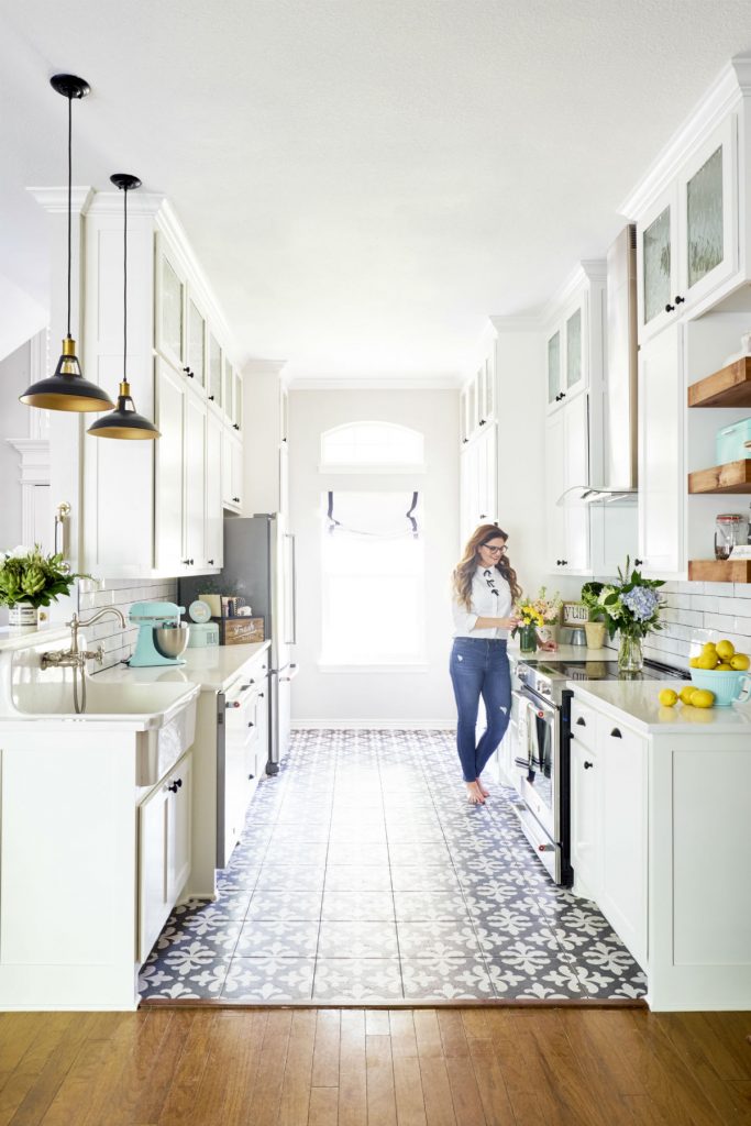
The sleek lines and satiny steel finish of my client’s new suite of appliances did worlds to bring her kitchen into the 21st century. Taking the backsplash and stove vent to the ceiling added fool-the-eye visual space, as well as high style.
Tip #5 – Wow Factor
If you want a great look to replace old beige, boring builder grade kitchen tile, patterned tile has real verve and vitality. It grounds this all-white kitchen with some jaunty contrast. (And I must ask: aren’t those black and brass pendants the cat’s pajamas? They’re just the exclamation mark this white kitchen needed!)
Remodeling this formerly closed-off galley kitchen and bringing it into orbit with the revamped dining and living spaces gave this whole home new life!
Want to know where to shop for these items?
Is your nest in need of reconfiguring and redecorating? I have ideas!

Do you want up your design skills?
Is your favorite style now out of date?
Find out here…
What Other People are Reading…
RoundTop Antiques Week in Texas 2026: Where to Stay, What to Bring, and How to Shop It Well
Everyone talks about like it’s just a shopping trip. It…
How to Shop at Round Top Antiques Week in Texas: Part One
No one really explains Round Top Antiques Week properly. Most…
3 Rooms in Your Home that Need Refreshing in the New Year
There is something wonderful about a clean calendar page. It…
6 Interior Design Trends for 2026 You Should Know About
Every year, interior design shifts just enough to make us…
3 Christmas Table Settings to Try This Holiday Season
Christmas table settings are one of my favorite parts of…


