Courtney Warren is a Texas-based interior designer whose work has been featured in Real Simple, Better Homes & Gardens, Good Housekeeping, Apartment Therapy, and Today.com. She is a frequent consultant on Fox 4 TV’s Good Day program in Dallas, was ranked in the top 3 percent of interior designers in the US by Houzz.com, and starred in the Dallas episode of TLC’sFour Houses. She delights in helping overwhelmed clients create beautiful spaces—and will never turn down a warm chocolate chip cookie or Diet Dr Pepper.
Shop the projects
My Go-To design accessories
6 Easy Steps to Arranging a Bookshelf
I hear homeowners say things like, “Why, oh why, do those magazine photos of bookshelves look so perfect and mine look so [fill in the blank]…”
*so blah
*so empty
*so full
*so haphazard
*so like-I-tried-too-hard
Sure, the magazines have stylists to prep their photos, but you can do what they do, because I’m going to show you how! Ready for Bookshelf Styling 101? Here we go!
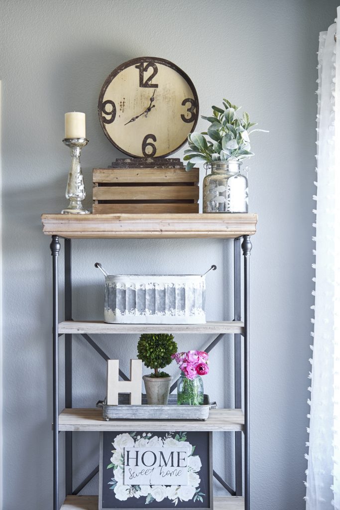 Empty your shelves and start with a blank slate. A good way to start is to build on a theme. Here I used rustic, farmhouse items: tin and wood, chippy finishes and mason jars. BUT a surprise element is always fun, like the mercury glass sparkle on top!
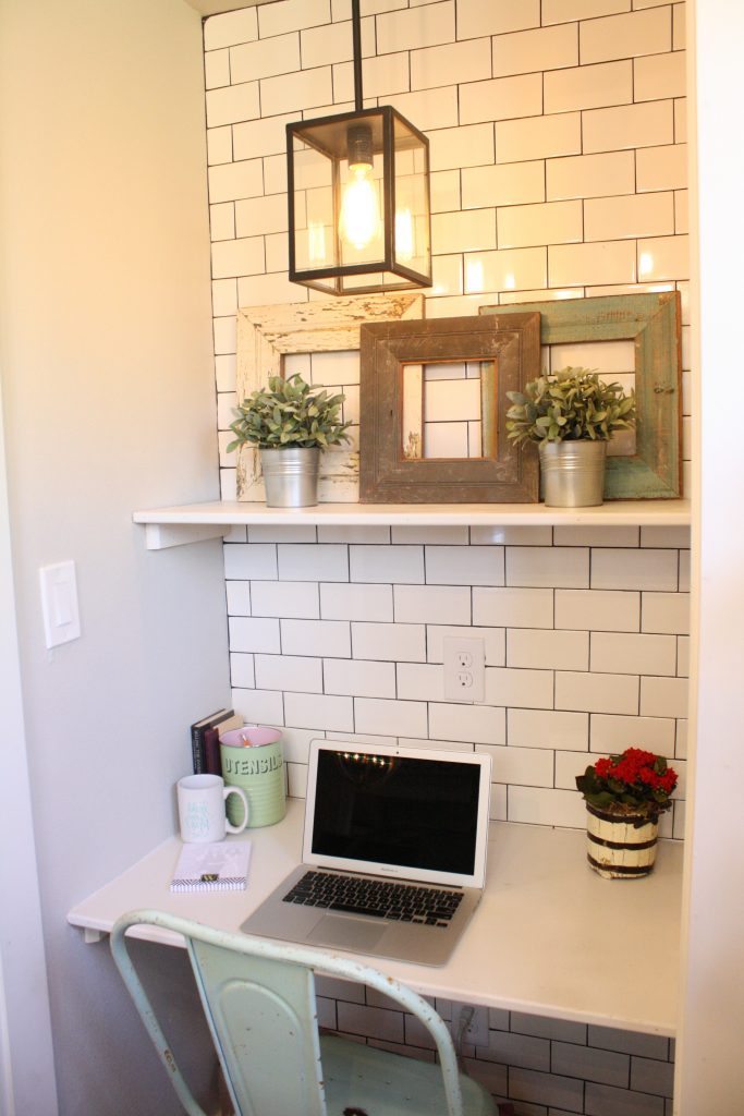
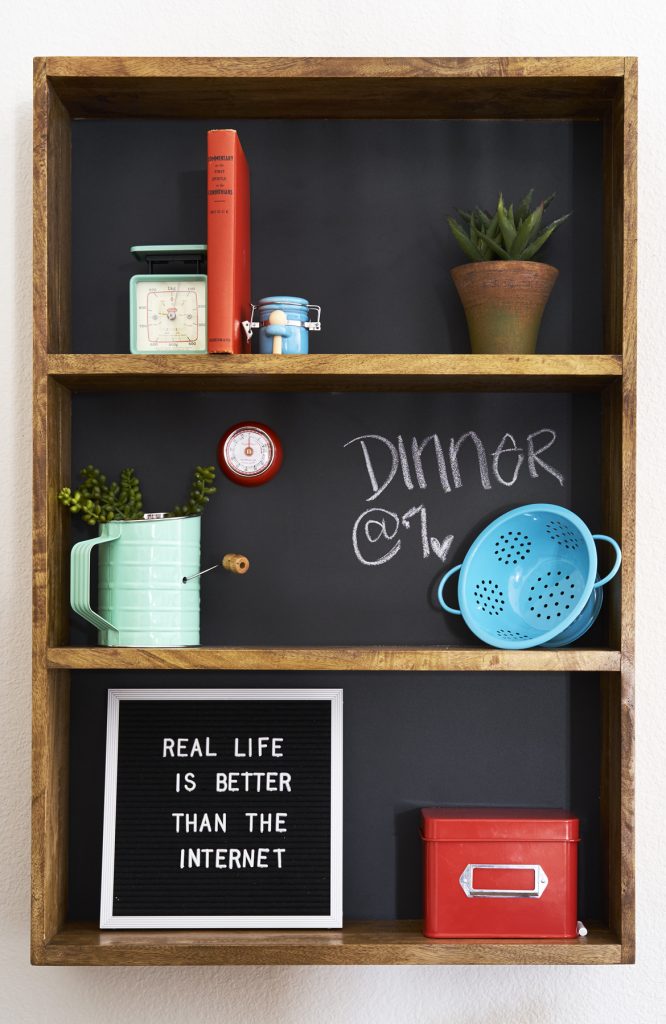 Keep scale in mind. Fewer, bigger items make more of a statement. Resist the urge to fill a small shelf with a bunch of small items that get lost. This chalkboard-backed shelf features just a few colorful kitchen items.
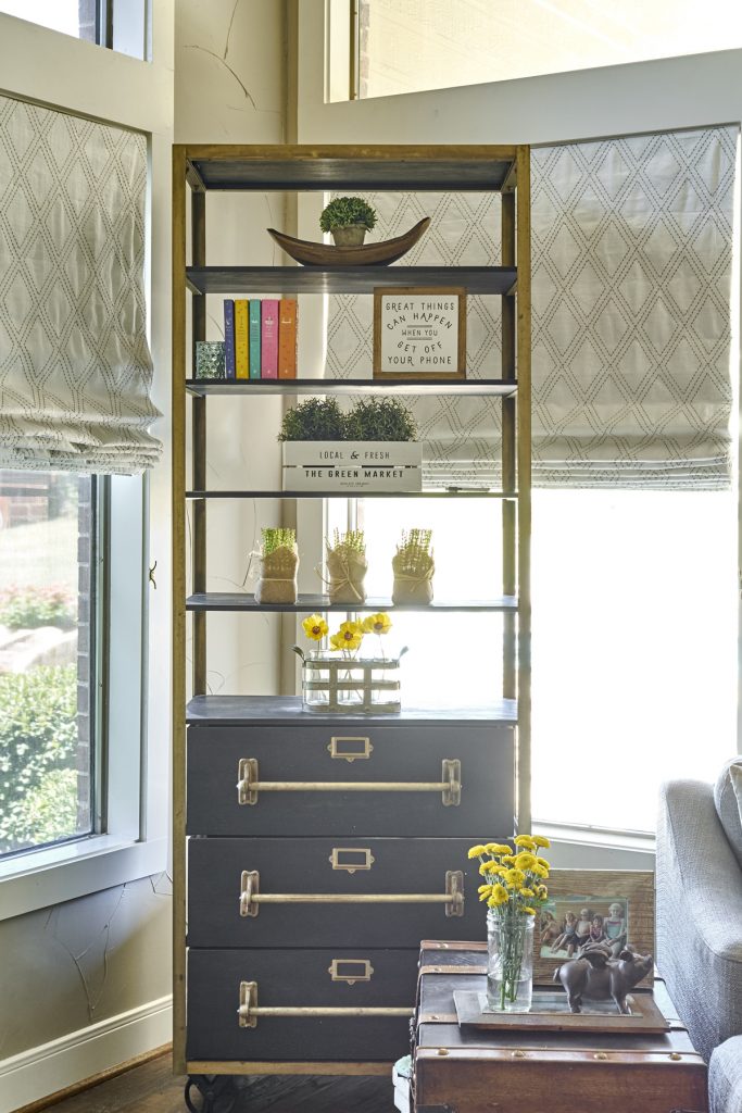
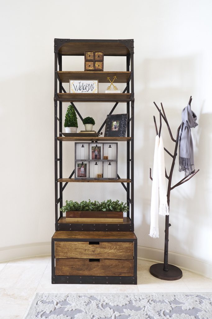 Variety is key. If possible, vary shelf height. Also vary the height of items you display, and vary shapes and textures, as I did at this client’s home.
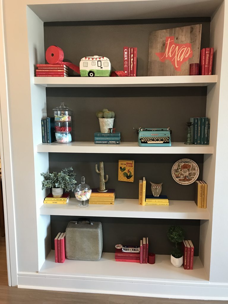
To achieve variety in this State Fair Airbnb property I turned some of the books horizontally and some vertically. But the unifying element of repeating color ties it all together. Your repeating element could be color, books, a metal finish, or maybe plants. And when you place these pieces, think zig zag. Notice how the plants are not all on the same side?
