Courtney Warren is a Texas-based interior designer whose work has been featured in Real Simple, Better Homes & Gardens, Good Housekeeping, Apartment Therapy, and Today.com. She is a frequent consultant on Fox 4 TV’s Good Day program in Dallas, was ranked in the top 3 percent of interior designers in the US by Houzz.com, and starred in the Dallas episode of TLC’sFour Houses. She delights in helping overwhelmed clients create beautiful spaces—and will never turn down a warm chocolate chip cookie or Diet Dr Pepper.
Shop the projects
My Go-To design accessories
Grandmillennial French Country in Highland Park
Timeless and incredibly versatile, that’s a blue and white color scheme! Really, who doesn’t like blue?? (When I ask people their favorite color to design with, 9 times of out 10 they say blue!).
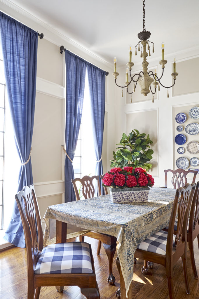
So many shades of blue and so many ways to apply, adapt, and tweak blue and white. In this client’s home, I brightened the wonderful traditional bones with a lively blue and white scheme. Blue and white adapts to any decor, from farmhouse to ultramodern.
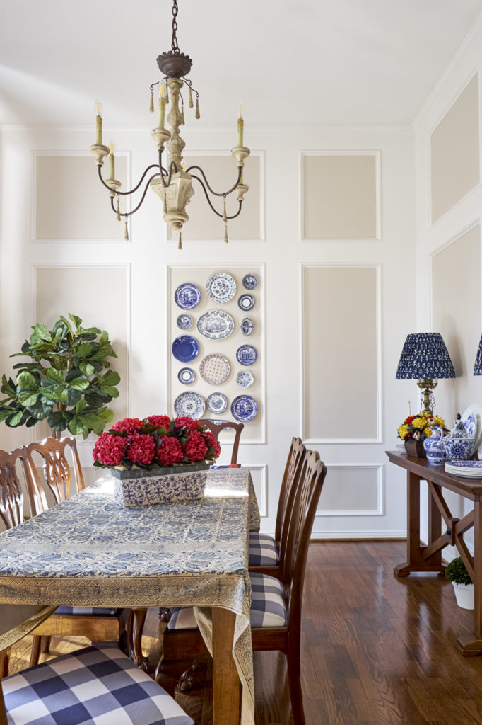
Sometimes a refresh is as close as your fabric retailer! Recovering these dining chair seats in a punchy large scale check tones down their formal lines and, along with the table linen, brings a country French vibe to the dining space. The blue echoes around the room, in the tall window panels and the focal wall of blue and white plates. (I love decorating with plates, don’t you?)
We also jazzed up the space with this gorgeous chandelier. Lighting makes such a difference!
The beautiful thing about blue and white is how easily it teams up with a third color.
Yellow? Sure!
Turquoise? Yes, please.
Pinks? Absolutely!
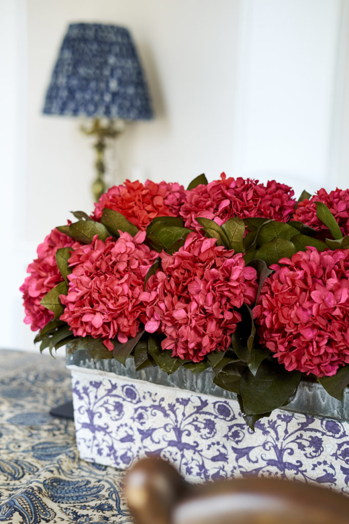
Here, a vivid pink flower arrangement absolutely draws you into the room.
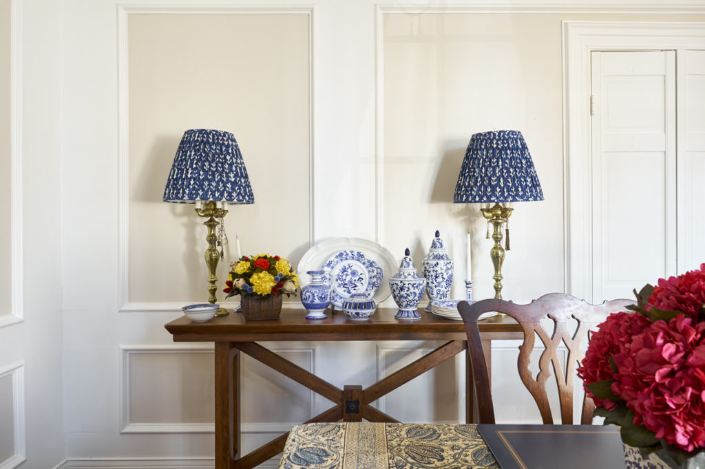
The sideboard lamps and china continue the blue and white scheme and country French theme.
When styling a tabletop, vary your shapes, heights, and textures for interest.
But the symmetry of the lamps bookends the arrangement so that your eye says, “Ahh…”
Don’t you love the shades? They carry the blue and white theme and add some style to the antique lamp bases this client already had.
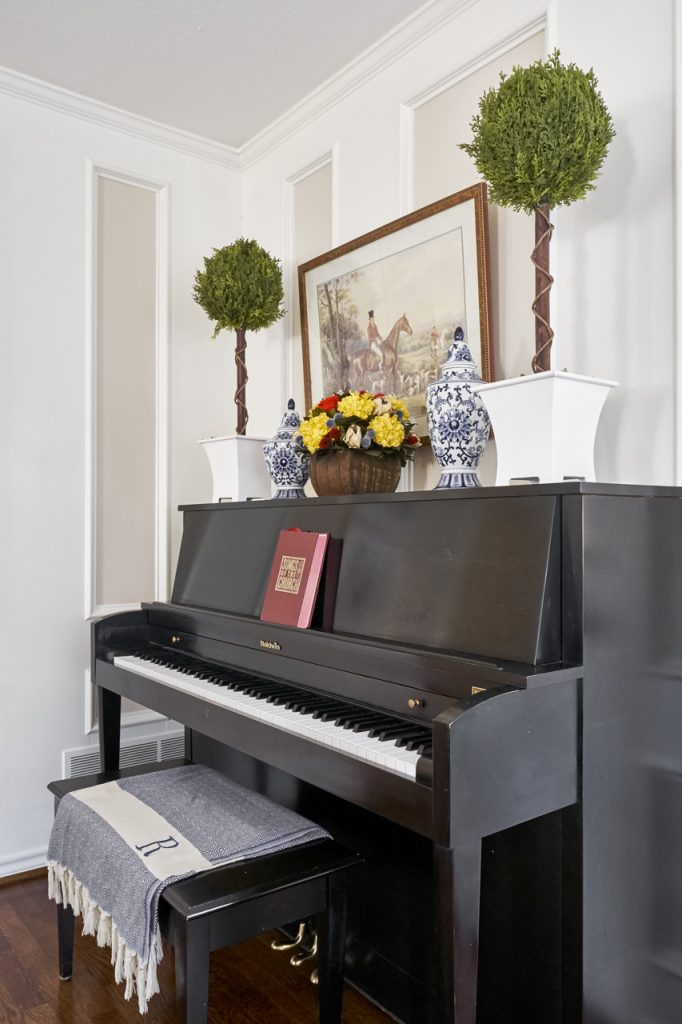
See how the symmetry works here, too?
(With all the hard edges of molding and piano, we needed a little softening from the round topiaries and the textile on the bench, didn’t we? Not to mention personalizing with the owner’s initial.)
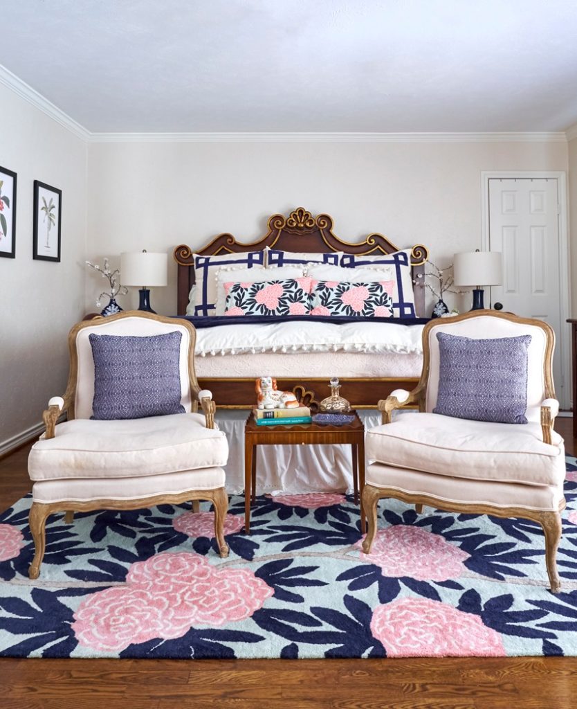
Same colorway, but totally different effect in the bedroom! The blue and white basics are there in bed linens, lamps, chairs and pillows, and the large scale floral rug amps up the pink factor in the equation.
This adorable fabric and rug was the main focal point. The client already had the bed, so we added some beautiful two-tone chairs for her to incorporate a sitting area in the bedroom.
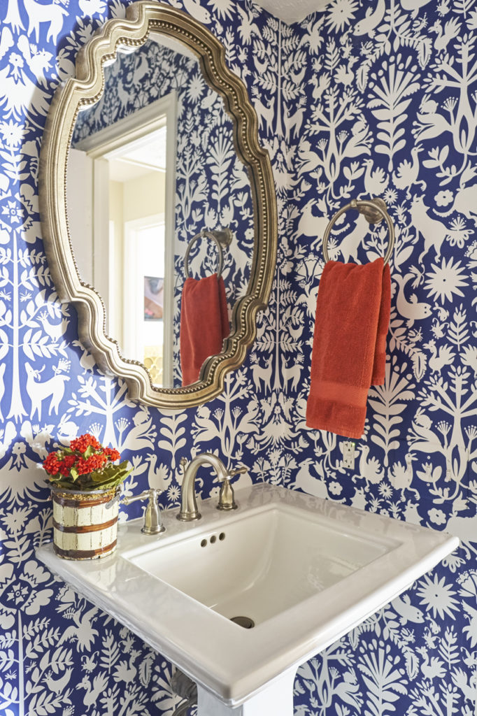
In case you haven’t noticed, wallpaper is back! In the powder room, we used a bold blue and white design in a folk art pattern. Especially with a punch of third color, blue and white brings cheer to every space.
Bonus: This was a fun photo because it got reposted by the wallpaper company Hygge and West! That was a big honor because they probably see a lot of wallpaper. 🙂
Have you ever used blue and white in your home? Is there a tried and true color scheme you’ve always loved?
How can I help you bring your ideas to life? Let’s talk!
