Courtney Warren is a Texas-based interior designer whose work has been featured in Real Simple, Better Homes & Gardens, Good Housekeeping, Apartment Therapy, and Today.com. She is a frequent consultant on Fox 4 TV’s Good Day program in Dallas, was ranked in the top 3 percent of interior designers in the US by Houzz.com, and starred in the Dallas episode of TLC’sFour Houses. She delights in helping overwhelmed clients create beautiful spaces—and will never turn down a warm chocolate chip cookie or Diet Dr Pepper.
Shop the projects
My Go-To design accessories
A Tour To My Dream Custom Home in Dallas
Our house is finally coming together after a year of building, and I want to take you on a tour and show you my new home reveal!
Let’s hit a couple of highlights today!
My New Home Reveal:
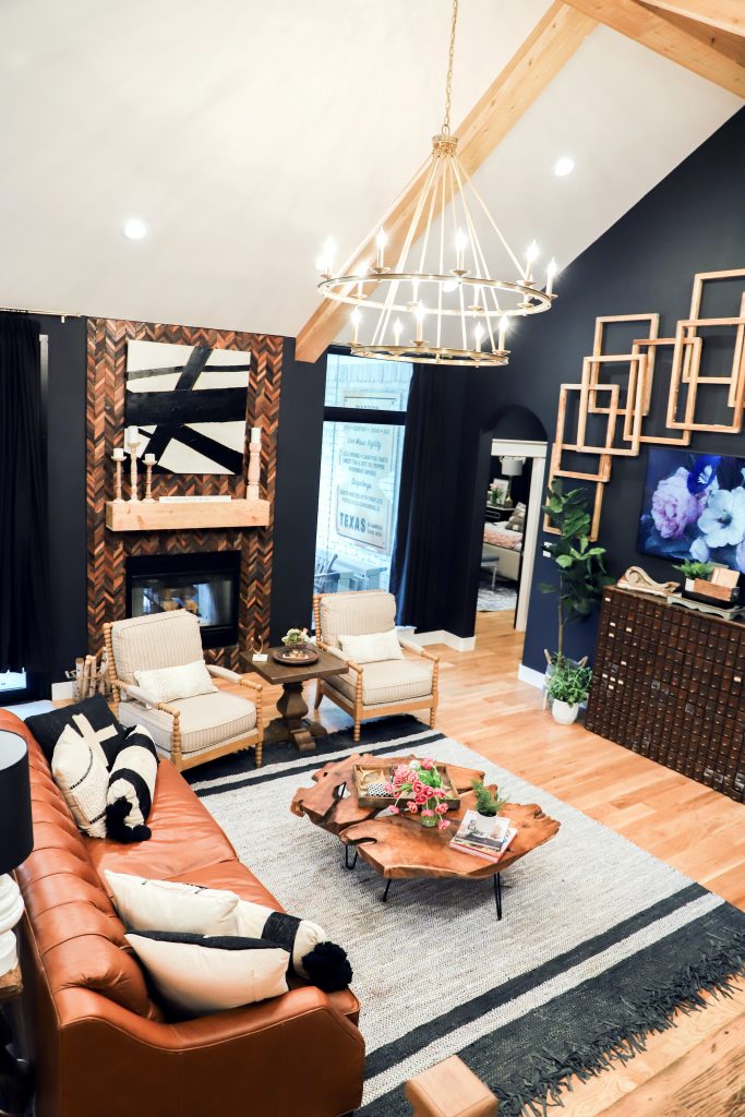
Living Room: Vaulted Ceiling with Beams
Designing this space, knew we wanted an open floor plan with tall beamed ceilings
Since the tv was on a focal wall, got a decorative to and took the focus off by doing unique wall
installation by layering frames!
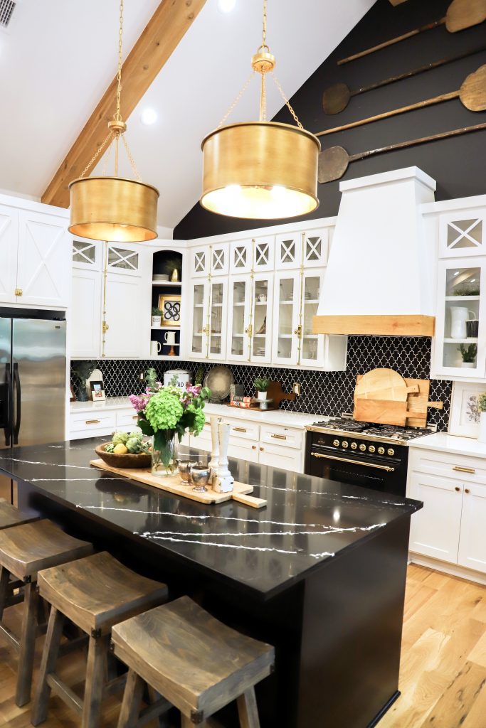
What we wanted in this area:
- breakfast table but also a dining table- added a banquet for breakfast &
- free standing for dining….have enjoyed this bc we use both.
- Wanted the back wall to be mostly windows
- Hardwoods floors and neutral colors
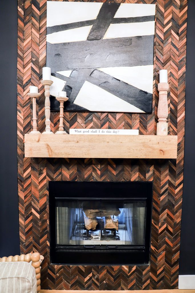
- Two sided fireplace- still jot sure about this bc letting air in
- contrasting countertops with island and surround.
- Ceremone bolts for hardware.
Kitchen Sources:
Lighting: Kichler and Savoy House
Download the paint colors I used in my home..
What kind of flooring should I put in my new home?
When I started choosing tile for our custom build, I felt like the proverbial kid in the candy store. So many shapes, colors and textures. I knew I wanted to create a custom look and used tile to set my spaces apart. I love a bold, interesting design, and tile was the medium that would give me the creative space I longed for. Do you ever consider using tile in a bold way?
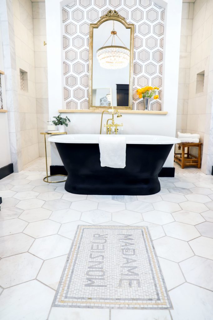
Finally the master bedroom is my place to retreat. An oversized freestanding tub and large shower allow me to get away from the stress of the day. I used marble in contrasting shapes and coordinating lighting to make this truly feel like a get away! A final French mosaic saying “Madame and Monsieur” makes sure my husband doesn’t stray too far to store his cologne on my vanity. Just kidding. If anyone overruns the bathroom countertop with products, its me. Thankfully these vanities have large baskets to corral all the supplies I may need one day.
Using Brick Indoors
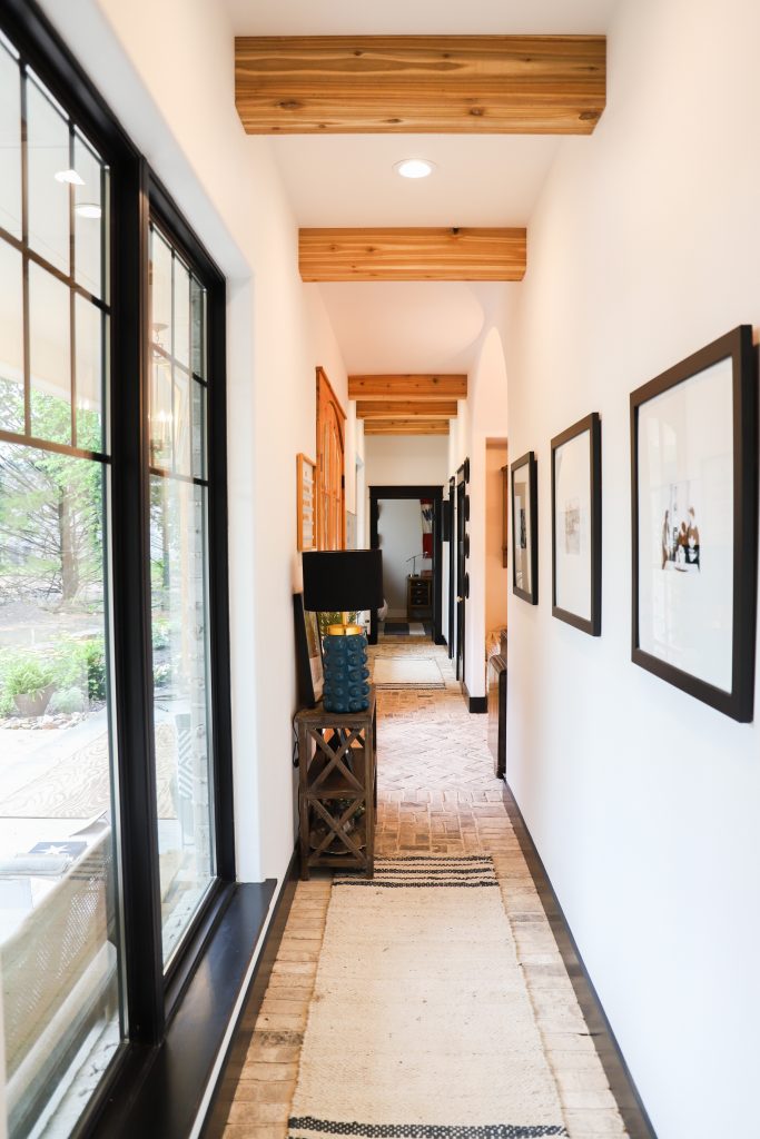
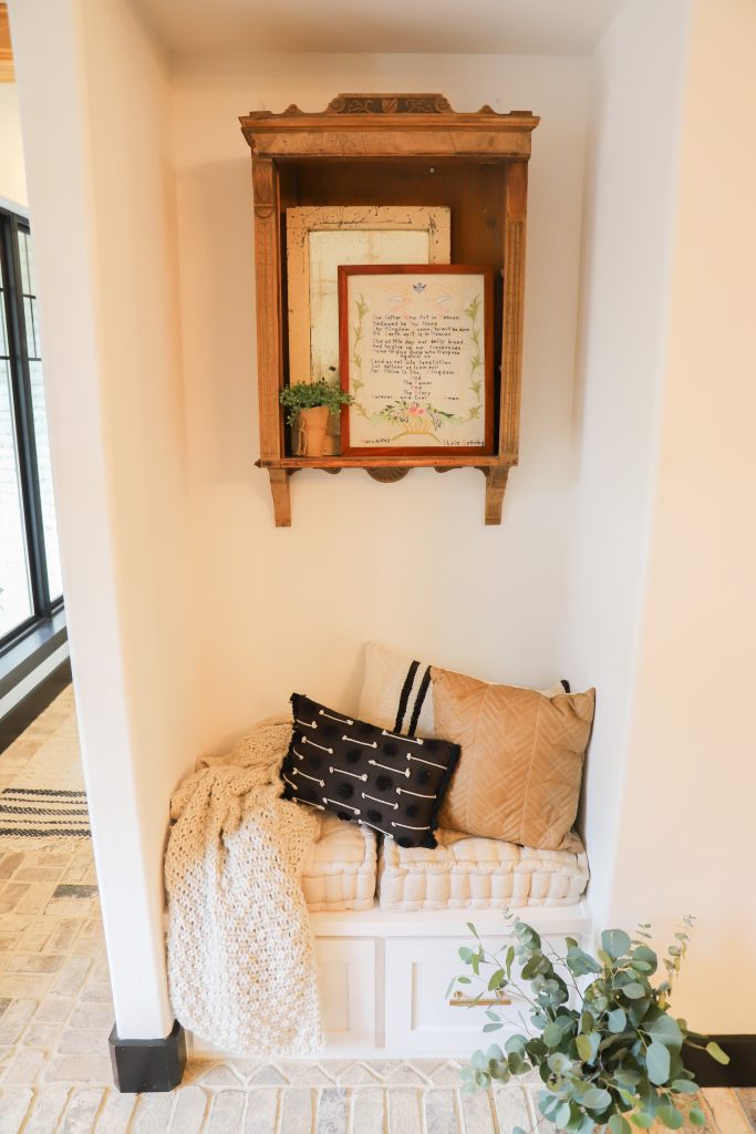
Halls:
A prime example: one of my concerns was entry points into the home. Because we wanted a huge yard and connection with the outdoors, we chose to build on a wooded lot outside of town. Consequently, we have wonderful country views–and lots of tracked-in dirt.
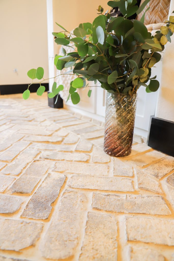
That’s why I chose brick pavers in the entry. Brick floors are having a bit of a renaissance, have you noticed? They’re earthy and natural and have great texture and color. They offer slip resistance, too (think “coming in out of the rain in wet shoes”!) Some folks might pass on brick floors because they’re such a hard surface, but that’s part of why I picked brick–it will last FOR. EVER. With two boys (and also, um, my tendency to move furniture around a lot), I can’t emphasize durability enough.
From a designer’s standpoint, the vintage-look pavers I chose from Cherokee Brick have a beautiful rustic aesthetic that fits with the informal vibe I was going for in our design. From a mom’s perspective, they will wear like iron, hide dirt, and stand up to many scrubbings. So while “long lasting” was high on my checklist, I wanted beauty, too.
The Main Hall
In the main hall, I had my neutral tone pavers installed in a herringbone pattern edged with a linear border. Herringbone is a classic layout that adds just the right amount of visual interest. I love the way the light from the front door sidelights plays on the floor’s pattern.
In the two branches off the main hall, we switched it up a little and went with a two-by-two layout (a block of two pavers turned alternately horizontal, then vertical) with a linear border. I think the change adds a little variety and helps delineate the public and private areas of our home.
Most people ask how we clean them–with a mop and broom.
Front Porch
Should I use Gas or Electric Lanterns?
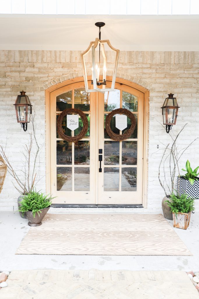
I have always wanted gas lanterns, so when I saw these cooper Primo Lanterns, I was thrilled to incorporate them! I am just so excited to be sharing these rooms in my new home reveal.
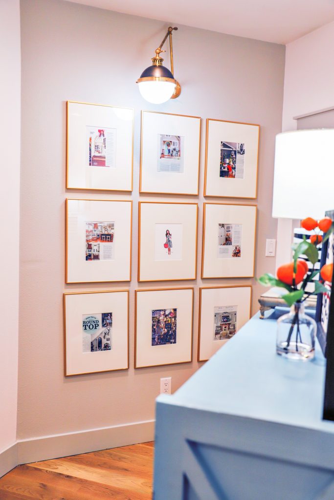
How I created a Gallery Wall
Outside the interior design studio, I framed some of my favorite magazine articles that I have been involved in.
Mudroom
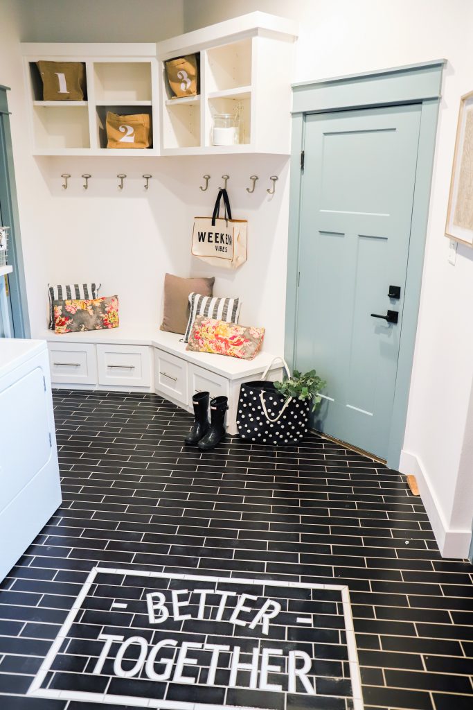
This subway tile mosaic is a show stopper in the mudroom with the unifying message that gives us a wink as we come and go. I choose black tile with white wording to make the message pop.
The black subway tile goes through the mudroom with the sentiment in the middle of the floor.
To complete the home, I partnered with some amazing sources…
Lighting: Kichler and Savoy House
Plumbing: Kohler and American Standard
Wallpaper: Milton and King, custom: Wunderwall
Brick wall and floor: Cherokee Brick
House numbers: Drop Cap Studio
I hope you enjoyed this tour and my new home reveal. Be sure to check out my blog on how to pack personality into a small space.