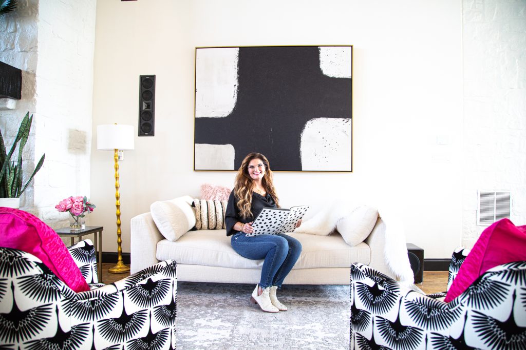
Courtney Warren is a Texas-based interior designer whose work has been featured in Real Simple, Better Homes & Gardens, Good Housekeeping, Apartment Therapy, and Today.com. She is a frequent consultant on Fox 4 TV’s Good Day program in Dallas, was ranked in the top 3 percent of interior designers in the US by Houzz.com, and starred in the Dallas episode of TLC’sFour Houses. She delights in helping overwhelmed clients create beautiful spaces—and will never turn down a warm chocolate chip cookie or Diet Dr Pepper.
Shop the projects
My Go-To design accessories
Texas Home Makeover: Before & After
We’re so excited to share one of our most recent client projects with you! A beautiful Texas home equipped with two laundry rooms, a dog grooming and bathing center, and cathedral ceilings arched with wooden beams. And although this build was a custom fit for our client’s life, it did not reflect her style.
That’s where we came in! We injected comfort and personality into every nook of this home.
As many of you know, a builder’s build tries to appeal to the masses — which means — everything from hardware to countertop finishes and paint choices involves neutral and safe picks. Our goal: to design a great living space with a relaxing family atmosphere and lively look!
From its original state to the stunning masterpiece it has become, this Texas home is the perfect example of turning a builder-grade house into an eye-catching, one-of-a-kind residence. With carefully planned and creative design elements, this client’s artful transformation will make you want to start your own renovation project immediately!
Let’s go!
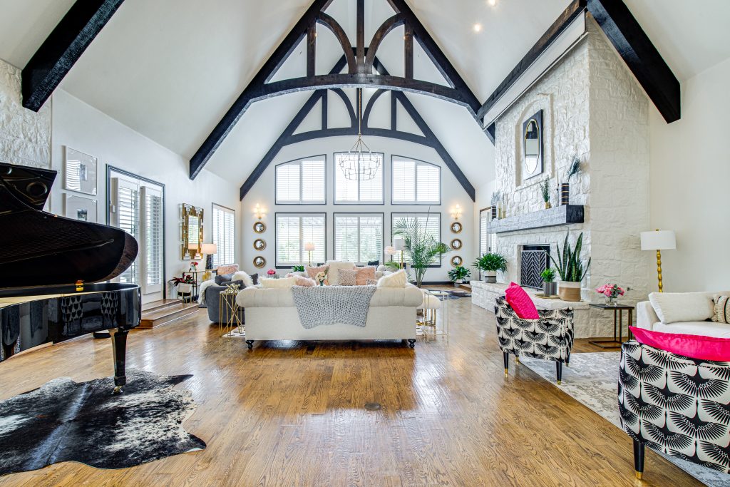
The Great Room
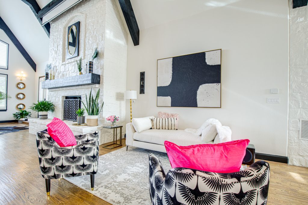
First up–the great room. In open spaces like this, it’s crucial to break the room up into zones. Each zone serves a specific purpose but still fits together with the whole space (without feeling blocked off).
In the center, we placed two chesterfields sofas in symmetry. We arranged all seating conversationally. On one end, close to the fireplace, we added two faux fur accent stools. On the opposite end, we set a curvy dark grey accent chair. Since we designed this room for REAL living– we selected cozy and easy-to-clean pillows, throws, and fabrics.
Top Tip: If you have young kids (or adults) prone to spilling. Or if you entertain and don’t want to stress about a potential wine stain– buy your furtniture in performance fabrics. These fabrics are highly durable, cleanable and many times, fade-resistant. Performance fabrics also come in a variety of options–cotton, linen, and velvet to name a few!

With multiple seating options for watching TV, reading, or chatting with friends, it’s a zen space for the young and young-at-heart! We also arranged every decor and furniture element to flow well with the open space floor concept. So whether our client is playing the piano, cooking in the kitchen, or reading a book by the fireplace, every zone is in clear sight of the other.
BEFORE
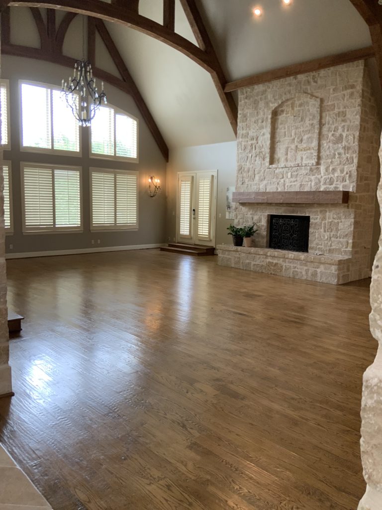
AFTER
You can notice the lack of color in the before photo. The heavy emphasis on neutrals made this space feel uninviting. Now, with bright white walls, pops of dark pink, and a nice play on patterns in the space, it feels FUN and warm.
Multiple Entryways
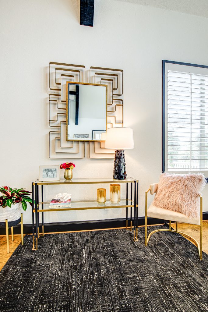
As we tackled color in this home, we also renewed each of its entryways. In total, aside from the formal foyer, there were two additional entryways. This was key to planning the design concept. We gave each entrance its own zone. To do this, we added console tables to each space with a scaled mirror right above.
Kitchen
Along with creating zones, we wanted to keep the kitchen cohesive with the rest of the open space floorplan. The original kitchen also felt very safe. It came with standard white cabinets and gray walls. The pendant lighting was in a black iron finish.
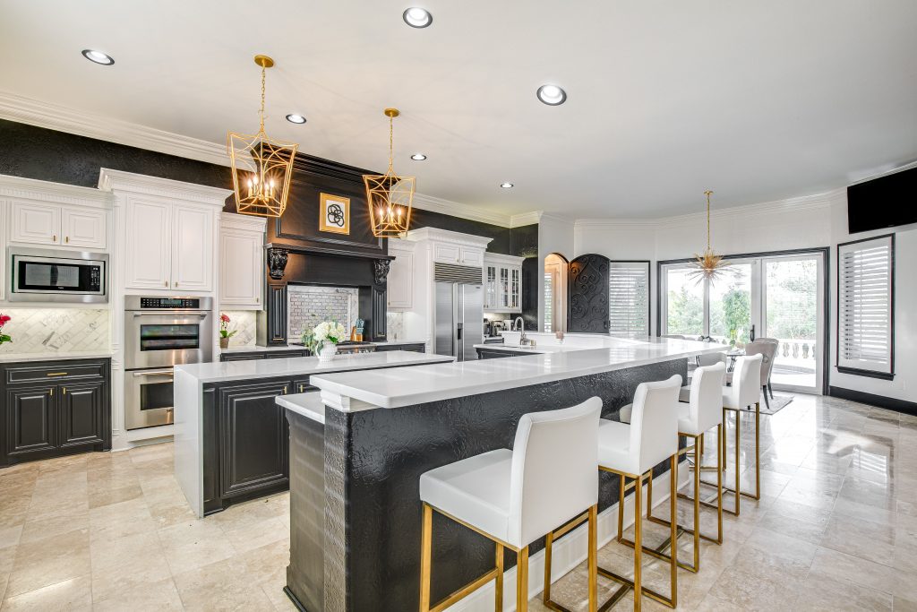
We upgraded the colors with a timeless black and white color palette. Instead of black iron accents, we opted for gold pendant lighting over the island and matching cabinet pulls.
The contrast of gold, black, and white make this space bold without feeling too overpowering!
Top Tip: It’s OK to mix metals in your space. If you want your pendant lighting to have a different finish than your kitchen faucet–go for it! If you’re not too sure how to mix metals, here’s a quick how-to guide.
BEFORE
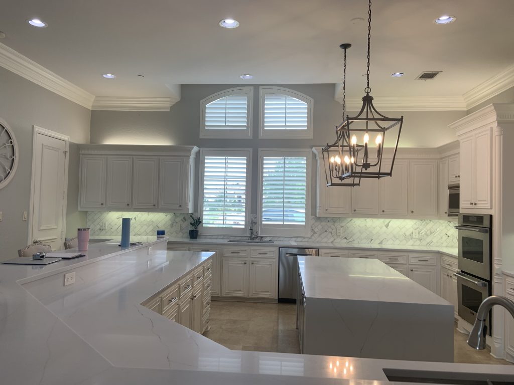
AFTER
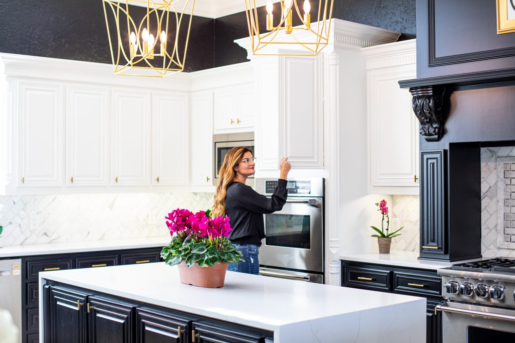
Now, this space feels bright and modern. We used the same black shade that you saw on window trims in the great room here on the cabinets. Since we kept the color palette cohesive with the other rooms, this two-toned kitchen fits the rest of the open space floor concept seamlessly.
There’s also plenty of seating that wraps around the kitchen perimeter!
Every beautiful Texas home needs a well-designed Dining Room
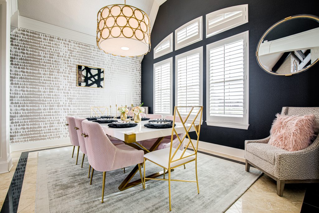
Comfortable seating is also a must-have for great dinner conversation. We wanted our client’s dining room to feel cheerful and inviting. First, we placed a soft silver rug underfoot and added a cheetah print accent chair in the corner.
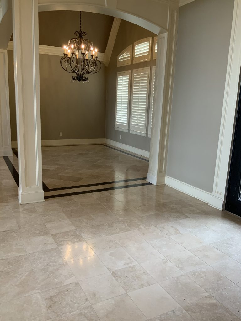
In the before, you can see how lackluster this space felt. The chandelier was also outdated and too traditional.
BEFORE
After adding two accent mirrors, there’s now a greater reflection of light in the space. By redoing the original painted walls with one black accent wall and another wallpapered–this space feels more alive!
Top Tip: Want an easy way to add character to a dull space? Wallpaper one accent wall. Wallpaper is no longer a 1980’s trend y’all! You can use wallpaper patterns that align with your design style in the modern era. Here’s more tips on how to use wallpaper in your home.
Plus, the black accent wall highlights the architecture of the windows in a sophisticated way. We also handpicked a stylish drum chandelier with a circular pattern to break up the room’s angles.
AFTER
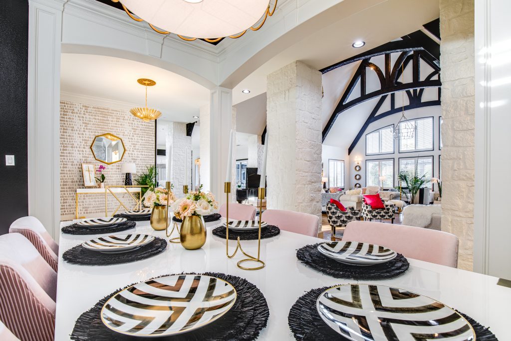
Now, this dining room feels serene—a classic place for entertaining or family dinner nights. We also always encourage our clients to step outside of a matchy-matchy look. Where’s the personality in that?
Instead, we paired dark pink striped accent chairs with a gold hostess (side) chair.
Since we emphasized brightening the bare bones of the space, i.e., the architectural elements and accent walls– we didn’t need many accessories to dress this table up. All it took was two modern candelabras with a pair of mini floral centerpieces, and voila–this dining table is ready to party!
We’re so delighted that our client feels inspired and at home in her spaces. Now, this house is no longer just a builder’s build– but a welcoming retreat and truly, a beautiful Texas home!
Head over here to tour the full project!
Let’s create a beautiful home that makes you happy.
Are you living in a builder’s build that feels lifeless? Let’s change that! I offer a complimentary, no-strings-attached phone call consultation. We can also consult by video conference. If you’d like to meet at your home, please know we will use all current safety protocols.
✆ EMAIL ME TO BOOK A CALL TIME!
Right now, we’re also offering E-Design. Find the details here!
DON’T FORGET TO CONNECT WITH US HERE:
- Instagram @courtneywarren
- Facebook page
- And check out what we can do for YOU on our YouTube Channel– Real Life Design with Courtney Warren Home.
