Courtney Warren is a Texas-based interior designer whose work has been featured in Real Simple, Better Homes & Gardens, Good Housekeeping, Apartment Therapy, and Today.com. She is a frequent consultant on Fox 4 TV’s Good Day program in Dallas, was ranked in the top 3 percent of interior designers in the US by Houzz.com, and starred in the Dallas episode of TLC’sFour Houses. She delights in helping overwhelmed clients create beautiful spaces—and will never turn down a warm chocolate chip cookie or Diet Dr Pepper.
Shop the projects
My Go-To design accessories
Mundane Mantel? 6 Fresh Ideas!
Yep, it’s coming up sure enough summer now (100 degrees+ in Texas), so it’s not like we’re using our fireplaces. BUT that doesn’t mean we should IGNORE them. Because the fireplace and mantel are always a focal point of the room, we should give them their design due in any season. Keep reading….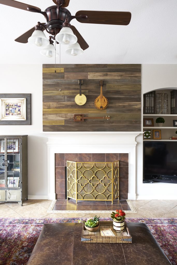
The oh-so-current brass finish and fetching pattern on the fireplace screen is a showstopper in the summer. No need to see the logs right now! The mantel and above are a great place to highlight collections, such as this one of my client’s stringed instruments. The rustic boards we mounted first play off other wood in the room.
(Do you have a collection that would benefit from a mantel display? You know collections always look better in groupings, right? Now don’t take this as permission to put out all 276 items in your elephant collection–please edit! You can choose favorites to show off, then cycle new items in…) 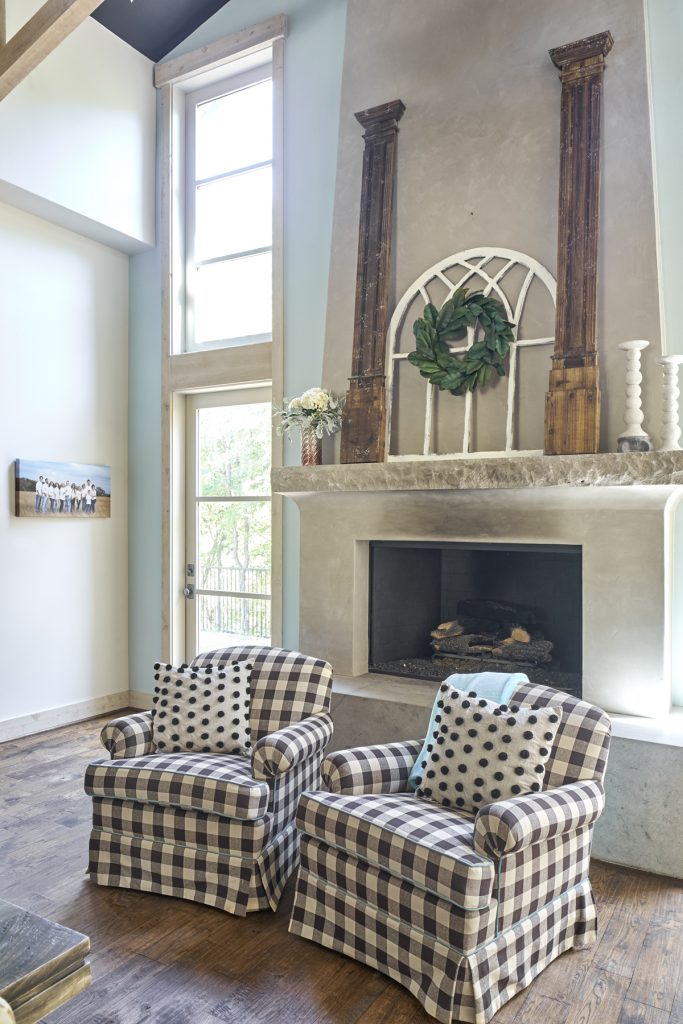
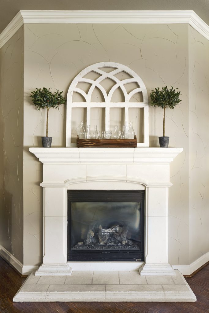
A grand space calls for a grand vision: my client’s to-the-ceiling concrete fireplace needed a display to both accent its grandeur AND bring it down to human scale. Enter architectural salvage! The rustic columns mediate the height and the curvy window frame softens all the straight lines. (Psst–a mantel almost always needs plants in the mix. The magnolia leaf wreath and big blowzy flowers strike just the right note. How could you work some plants into your mantel styling?)
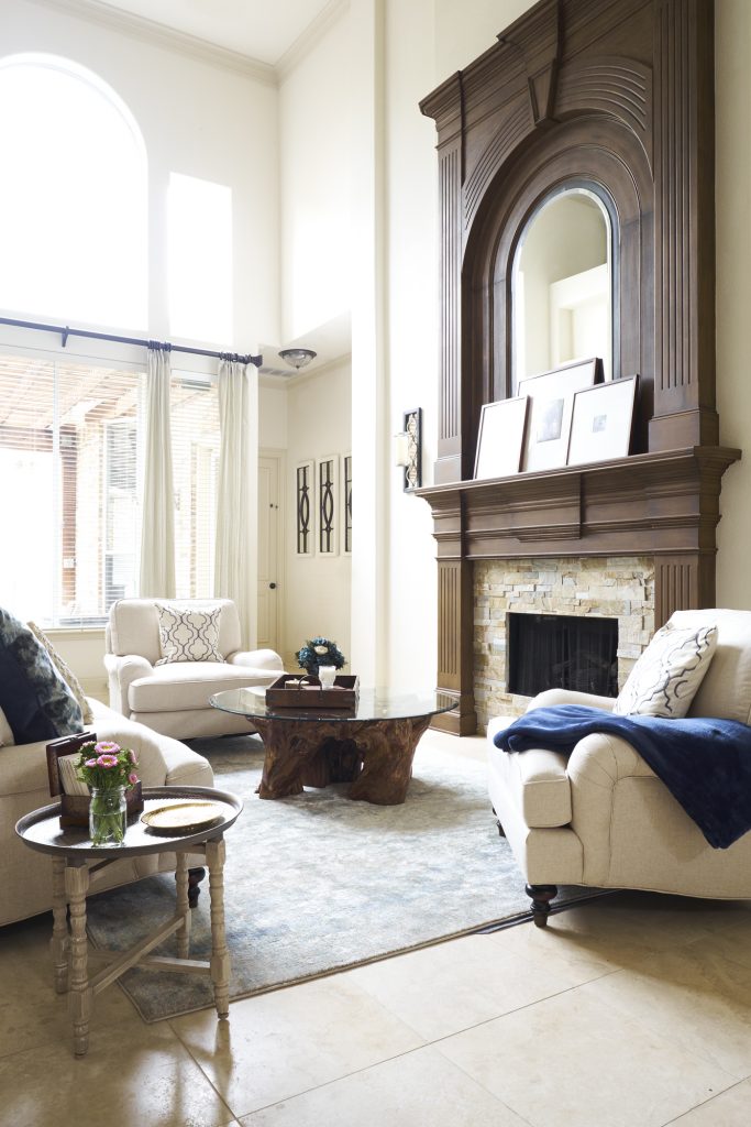
Another fireplace on a grand scale, this one in a grand golf course home. The proportions of the mantel and surround already made such a big design statement that it was a no-brainer to just prop and overlap simply framed art on the mantel. Perfection.
(This much dark wood doesn’t overwhelm because there’s so much light coming in, but if you have a dark wood mantel or dark brick that sucks the light from your room, consider painting them white–or even just whitewashing the brick.)
